28 Inspiring Email Marketing Examples to Get You Started (2023)
Is email marketing still relevant?
This thought has probably crossed your mind already, considering how extensive the list of marketing strategies is today. But no, marketing emails are still far from being irrelevant.
The graph proves our point very well:
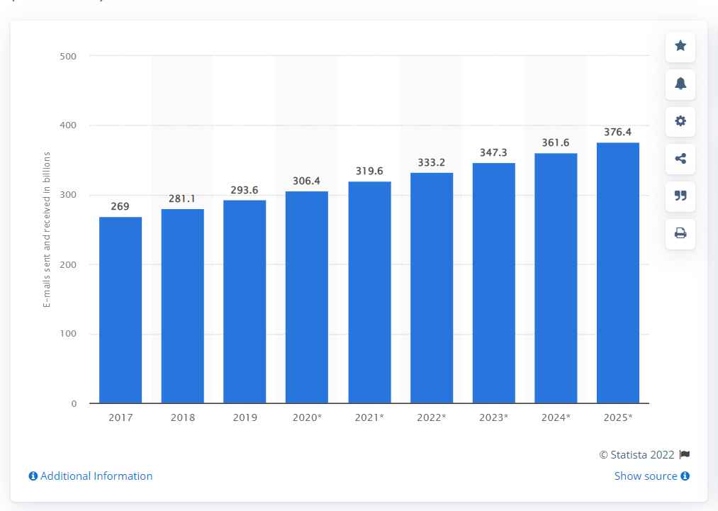
Of course, you can’t call every marketing email successful. We’re 100% positive that your inbox is at least 25% filled with spam that doesn’t carry any value for you as a consumer.
So, what does it take to create a really good email?
At Digital Marketer’s World, we strongly believe that the best way to learn is by drawing lessons from observations. That’s why we’ve prepared 28 email marketing campaign examples to supply you with ideas and much-needed inspiration.
Note: The first 20 emails give examples for B2B companies, and the remaining are for B2C businesses.
1. Freetrade
Are you planning a referral marketing campaign in 2023?
Good because it’s one of the surefire ways to level up your lead generation game, grow your email list, and attract high-quality prospects – they will be more likely to buy than other potential customers since they come to you through a recommendation.
Another perk of investing in a referral channel is that the leads you acquire this way have a 16% higher lifetime value. In other words, they are more likely to remain your loyal clients.
Email is one of the go-to options in referral marketing. You can use it to let your existing customers know they can now invite their friends to try your product and get a bonus in return.
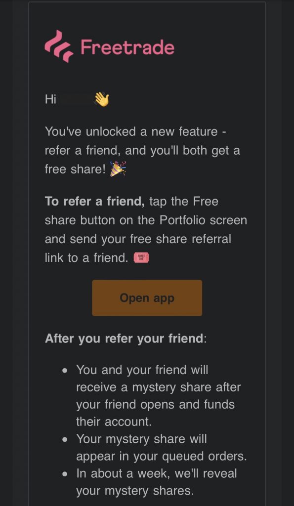
This example from Freetrade, a financial technology company, shows what such an email should look like:
What can we learn from this example?
- It’s best to get to the point right away – your customer now has an opportunity to invite referrals.
- The email should give clear instructions – a step-by-step guide on how to join the referral program.
- The addressee should understand the perks of participating in the program – the email should provide clear value.
There is no need for fancy design. Just make sure you provide a visible CTA button to direct a customer to the landing page with more details about the program.
Use case: Promote your referral scheme.
Why we love it: It’s straightforward and informative without being too long.
2. Viral Loops
If you’ve read our article on lead magnet ideas, you know that B2B companies often use case studies, e-books, samples, generators, and email templates to attract more potential buyers. This way, you offer something of high value in exchange for the prospect’s contact information.
So, when a prospect shares their email address, you need to send them a message with the link to the document they want to access. However, try to do it in an engaging way.
How?
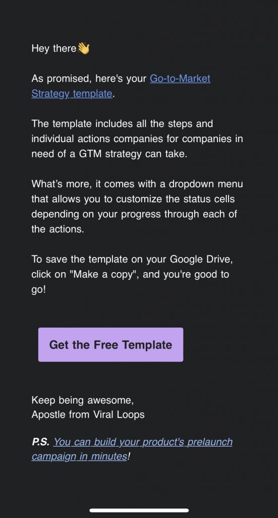
Take a look at the Viral Loops email below:
What makes it stand out?
First of all, it doesn’t beat around the bush – email content starts with a link to the template right away. But that’s not all.
You can also find a short description of the information the template provides and quick instructions on how to save it to Google Drive. And, in case the link at the top doesn’t work, you can always use the CTA button at the end of the email.
Also, look at the P.S. section – Viral Loops added an extra link to one of their guides. That’s an awesome trick to show prospects they can draw even more value from you.
Use case: Share free resources to generate leads.
Why we love it: It’s short and sweet.
3. Hootsuite
Now, we’ve entered the territory of newsletters, and you can’t say it’s an untapped one. There are hundreds of ways to share valuable content with your subscribers, so let’s take a look at a few of them to show you how companies tackle this task.
First comes Hootsuite. At first glance, it looks like a random email with a simple subject line, no outstanding design or CTA buttons:
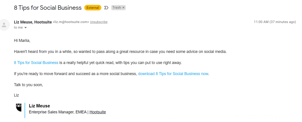
However, it has one interesting function – to reactivate a dormant subscriber by sharing an eye-catching piece of content.
If you look closer, you’ll see that the article in this email also has a specific intent – to prove that social media marketing is essential for a business (Hootsuite is a social media management solution – you can read about it and its alternatives here).
Use case: Reactivate customers via content sharing.
Why we love it: It has the right intent without forcing a subscriber into anything.
4. HubSpot
What if your blog mainly consists of case studies and original research?
You can still create automated emails highlighting the top picks for your subscribers. Such newsletters may not be as frequent, but they are definitely necessary if you have something truly valuable to offer.
Look at HubSpot, for instance. This CRM provider is also famous for its educational hub and shares resources only backed by research. The example below shows how HubSpot organizes its top content into a case study, with short bits of text to give a general idea:
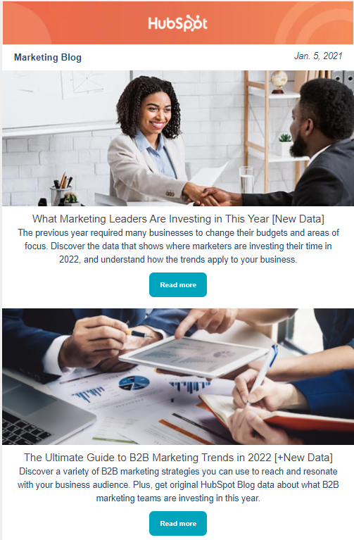
How can you improve an email like this?
Give behavioral segmentation a try. For example, a subscriber has been reading articles only about digital advertising. So, it makes sense to put together a personalized email newsletter with content picks that fit their needs. Besides, such an email will definitely have a higher CTR.
Use case: Provide the most recent content updates.
Why we love it: Content picks in this email are data-driven.
5. Later
Later is another example of a well-made newsletter. This social media marketing platform also puts together the list of the most recent blog updates with resources that might present the highest value to the reader.
For instance, in the example below, the first reference is the article on the Instagram Algorithm updates in 2022. Why did Later make this pick? The answer is simple – its solution focuses primarily on Instagram scheduling and analytics, so most users want to know what changes to expect:
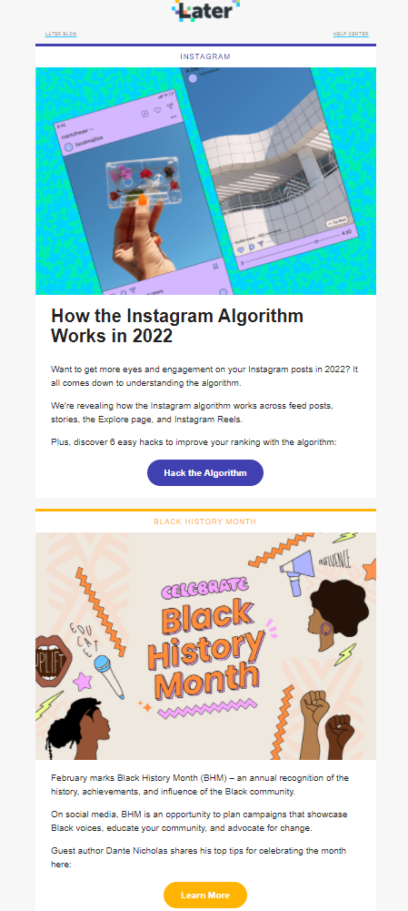
What’s great about this newsletter is that Later created original visuals instead of using stock photos. This is an important factor to consider if you want to build a successful email marketing strategy.
Also, pay attention to the first CTA – it is tailored specifically to what the first article in the newsletter is offering. We highly recommend you follow this practice and avoid overly generalized call-to-actions.
Use case: Keeping subscribers up-to-date on the latest blog content.
Why we love it: Original visuals and a clear CTA make this newsletter look fresh.
6. TheSkimm
Another newsletter example comes from TheSkimm, a daily newsletter. Indeed, it’s not your typical B2B company, but it’s a fantastic example of how you can deliver news in an engaging way.
As you can see from the image below, the newsletter is divided into clear sections, from the podcast episode announcement to the quote of the day and recent stories from the world of politics and more.
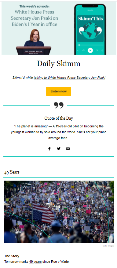
The structure is important in a newsletter as much as any other email type – it makes the message clearer and helps direct the reader’s attention to the parts that matter the most.
Recommendation: always give a person an option to both opt-in and unsubscribe from your newsletter.
Use case: Inform subscribers about the latest news in a consistent manner.
Why we love it: This newsletter is well-structured.
7. Mailchimp
One more newsletter we want to share with you (it’s the last one, we promise) is from Mailchimp. This company offers email marketing software, so these guys know how to put together an engaging newsletter for sure.
What definitely stands out in the example below is diversity in terms of content. Mailchimp not only shares blog posts but also includes videos in its message. You also get your dose of company and product updates:
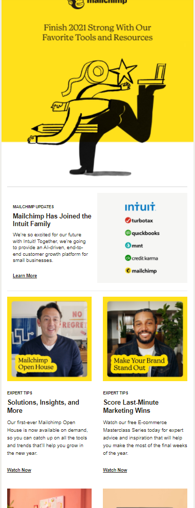
This example sums up everything that needs to be included in a newsletter. It has:
- Clear branding
- Straightforward message
- Structure
- Engaging, tailored, and clear call-to-actions throughout the email copy
These best email practices make a newsletter look professional and informative without being overstuffed with text and unnecessary visuals.
Use case: Highlight the latest company news and share relevant content with subscribers.
Why we love it: This newsletter doesn’t focus just on one content type.
8. Moosend
Now, we leave the newsletter territory and enter the realm of event announcements.
B2B companies use online events to raise awareness about their products and attract potential customers. For example, 53% of marketers agree that webinars at the top of the sales funnel bring high-quality leads. It’s also an excellent strategy to solidify authority in your industry and become a thought leader.
Of course, you can use a simple text email to announce your upcoming webinar, but what’s the fun in that? It’s always better to use an email as an opportunity to amplify the anticipation, as Moosend did in the example below:
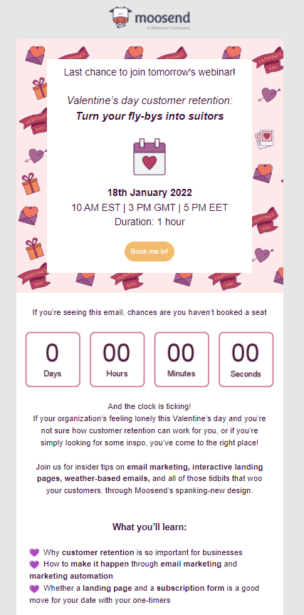
As you can see, the company used a timer to show how many days subscribers had to sign up to participate in the event. Also, take a look at the text – it boosts interest in the webinar with phrases like last chance, and the clock is ticking. This is a pretty standard FOMO strategy frequently used in emails and sometimes in content marketing.
Use case: Inform the subscribers about the upcoming webinar.
Why we love it: A straightforward message is complemented by an engaging email design.
9. MarketingProfs
If you have several events coming up, consider announcing them in bulk by putting together a schedule. Here’s a good example of such an email from MarketingProfs:
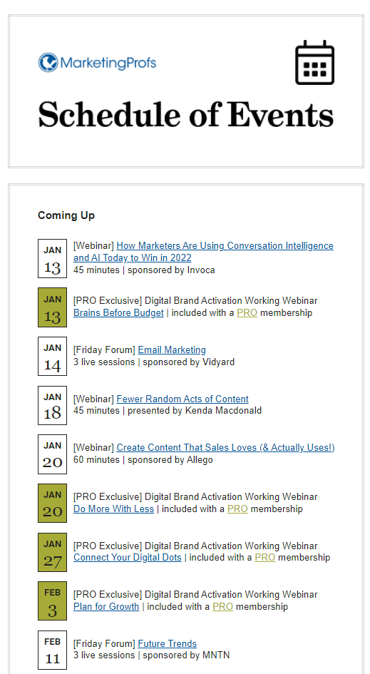
It’s a simple message listing the top events MarketingProfs has planned together with its sponsors for the upcoming month. You can definitely improve it by providing more information on each event or highlighting the key benefits. But the general idea is excellent, especially if you hold webinars on an ongoing basis.
Use case: Notify the subscribers about the upcoming events.
Why we love it: The idea is simple yet effective to keep subscribers updated.
10. BuzzSumo
Finally, if you want to increase attendance at your upcoming online event, it’s always a smart idea to set a series of notifications inviting subscribers to register.
At this point, it’s important to come up with a consistent schedule for these notifications. You can send a message a month and then every week before the event. The last reminder can be sent one week before the launch, like in BuzzSumo’s example below:
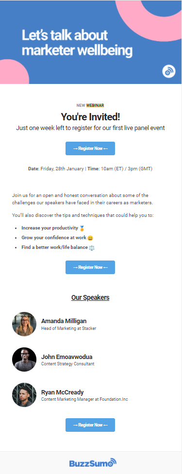
This example also follows a few other effective email practices a good event notification should have:
- The date of the webinar
- Topics it will cover
- Benefits for the attendees
- Speakers
Also, notice how BuzzSumo has placed the CTA buttons – one after each section of the email. It allows the subscriber to sign up for the event at any point but also leaves enough room for them to think over their decision.
Use case: The last call to invite people to sign up for your webinar.
Why we love it: It looks simple yet delivers a clear message.
11. Dribble
One more email example related to online events comes from Dribble. It’s a pre-registration message inviting subscribers to sign up for the webinar early with a 50% discount:
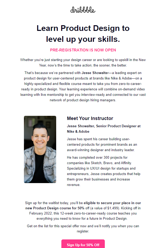
Such an email is a good example of how you can warm up prospects by offering them something exclusive. Apart from that, the discount, available only to Dribble subscribers, adds to the value of this email.
If you want this email type to work for you, don’t be afraid to go into details of how exactly a subscriber would benefit from your paid event. In Dribble’s example, the company decided to introduce the speaker and their vast experience in design as the reason for the prospects to sign up.
Use case: Warming up prospects before the event.
Why we love it: This email shows how to attract more event participants by offering something exclusive.
12. Seobility
Now, we’re going to talk a bit about promotional emails. B2B businesses also tap into FOMO (fear of missing out – one of the marketing theories used in emails) to drive more sales and increase product awareness.
Does FOMO really work?
Data shows that it does. According to Optinmonster, 39% of email subscribers say they feel envious, and 30% feel jealous when seeing an email indicating the offer is running out of time. These emotions, although negative, are the reason to use fear of missing out in emails in the first place. Besides, you can’t say it’s not working – 60% of millennials share that they bought a product within 24 hours after receiving a FOMO email.
Promotional emails using this approach often appear before the holiday season, offering discounts and lucrative deals. For example, this message from Seobility was sent to us before the New Year:
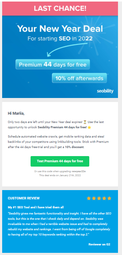
Notice how it highlights the obvious value – 44 days of free trial for the Premium subscription mentioned both at the beginning of the email, in the text, and the call-to-action button. This approach creates a feeling of urgency.
Use case: Increase product sales through an exclusive discount.
Why we love it: It leverages FOMO very well, plus includes a customer review as social proof to add credibility.
13. Grammarly
One thing that the email above lacks is sharing enough convincing reasons to persuade the customer they really need to buy the product as soon as possible.
But how can you do it the right way without being too pushy?
You can compare your free (trial) plan with the Premium subscription like Grammarly did in the email below. First comes the general description of the offer – 50% off the paid plan for all subscription types, plus a relevant CTa button:
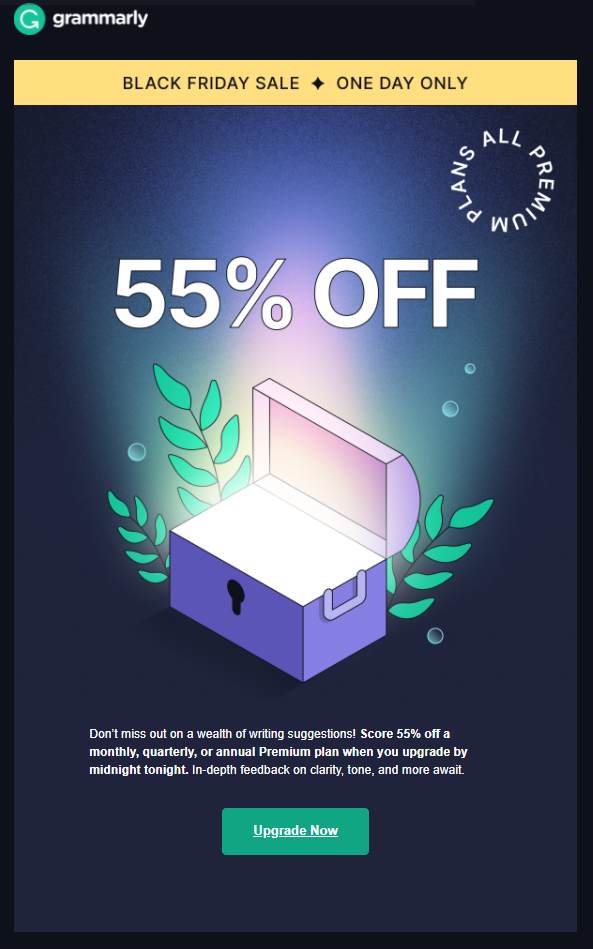
If you scroll down, you will see the comparative table of features the free plan lacks and the perks of upgrading:
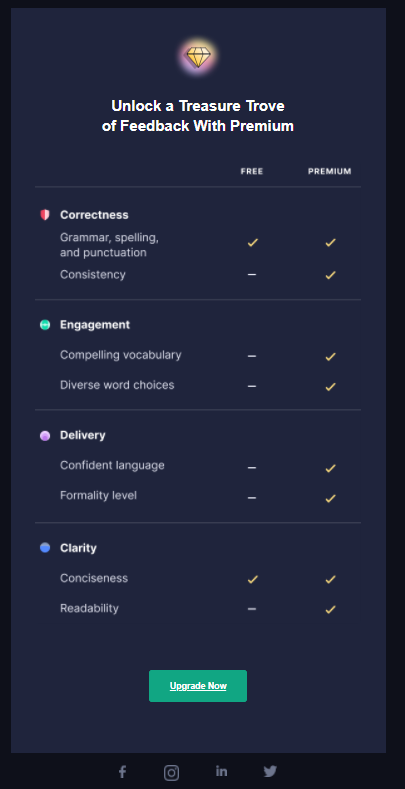
So, as you can see, you don’t always need FOMO to create urgency. It’s enough to show how your product can solve very specific problems and whet the appetite by making a lucrative offer.
Use case: Get more product sales by addressing customers’ needs and sharing a discount.
Why we love it: Grammarly doesn’t play with your feelings but gives solid reasons to upgrade your plan.
14. Woorise
B2B enterprises often do product updates to meet their customers’ expectations. SaaS companies can relate to this more than anyone else – their success and customer loyalty depend on continuous improvement.
So, let’s say you have a bunch of new product features coming. How do you announce them?
Take a look at this email from Woorise. It compares everything done for product improvement in 2021 and introduces the upcoming changes in 2022:
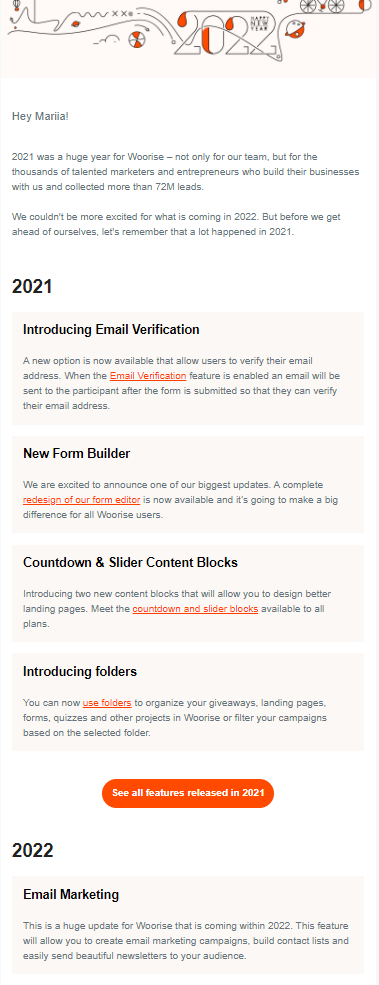
As a result, it gives a client a chance to see a bigger picture and evaluate all pros of staying with Woorise in the new year based on how well the upcoming product changes will answer their needs.
Use case: Introduce product updates.
Why we love it: This email allows a user to see the perks of a product objectively instead of creating unnecessary hype.
15. AgoraPulse
If you sell software as a service, you’ll also need a set of recurring emails notifying the user about the latest changes in the dashboard. It can be a new assignment from the colleague, an updated report, campaign changes, etc.
What should this notification look like?
It will depend on the nature of your solution. For example, AgoraPulse keeps it simple with a short message and a CTA button to redirect the user to the dashboard page that requires their attention:
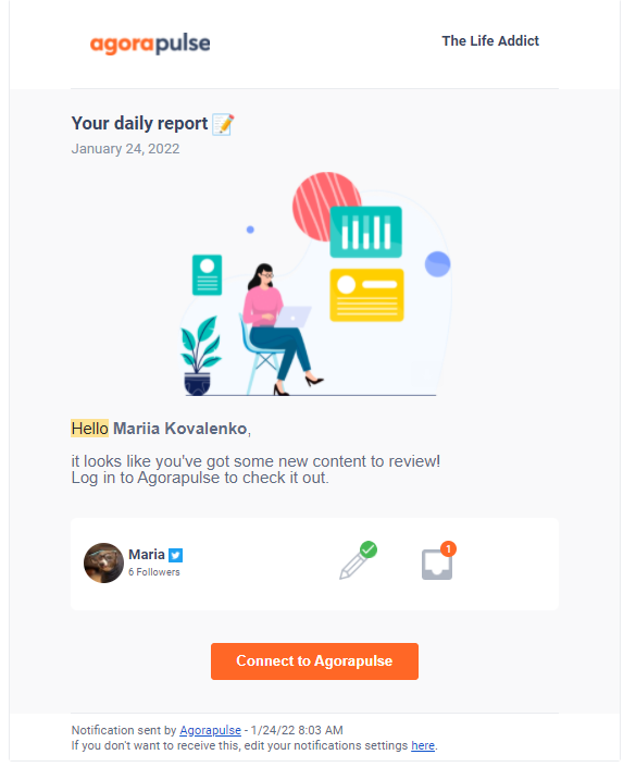
It makes sense to keep such emails simple – they only serve to keep the user updated and direct them to the dashboard where they can go through the new tasks. Email notifications are especially useful if you don’t offer a mobile app as an alternative.
Use case: To make sure the user knows about urgent changes within the product.
Why we love it: This email delivers a straightforward message without too much visual noise.
16. Sprout Social
If your product’s main task is to supply users with data, your notification email should reflect that. It needs to show the recent data updates and keep customers in the loop.
Take Sprout Social, for example. As a social media marketing platform, one of the solutions it offers is in-depth analytics. So, in weekly notifications, Sprout shares updates on the metrics describing the user’s overall social media performance:
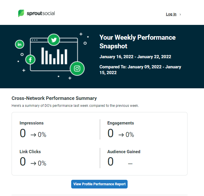
Of course, it won’t make sense to give away all the insights in the email – you simply want to briefly update and then redirect the user to the actual analytics report. That’s what Sprout Social is doing – an email shows a sneak peek of the KPI updates.
By the way, if you want to learn more about Sprout Social as a social media management tool, check out this article.
Use case: Provide regular updates on the client’s performance metrics.
Why we love it: This notification shares just enough information to give a quick overview of the KPIs if a user doesn’t have time to go through the entire report.
17. Monday.com
What if there are multiple things you need to update your customer on several times a day?
It complicates things a bit as you’ll have to develop the proper structure for the body of the email to retain the customer’s attention. Otherwise, if the notification is stuffed with too much information, it’s easy to lose focus and miss critical updates.
Need a reference?
Look at this example from Monday.com. As you probably know, it’s a project management solution, so it sends many daily notifications, and it’s important to keep them clear. Here’s how the company manages to achieve that:
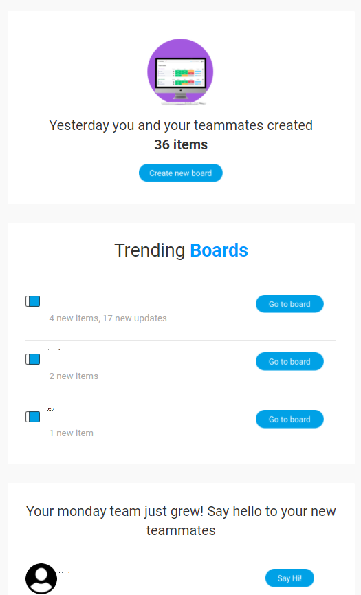
First of all, you get notifications for each board you and your coworkers collaborate on, with the number of new items and updates. Apart from that, there’s also information about the changes within your team, the number of new messages in the inbox, and the most important change that requires your immediate attention.
Also, notice how each new item has its own CTA button. This way, a user can easily navigate between the boards and sort recent changes from what has already been addressed.
Use case: Keep the customer updated on a variety of changes and tasks.
Why we love it: This email is a perfect example of how to organize information in a lengthy notification.
18. Crowdfire
Now it’s time for onboarding emails.
It’s a normal practice in B2B, especially with SaaS marketing agencies and companies, to help new subscribers or customers get familiar with the product. They devise a series of emails (and use automation to send them out) that talk about product features, show how to use them, and it all starts with a welcome message.
The role of the introductory email is to greet new users and help them navigate product features easier. Design and the choice of fonts play a crucial role here – a visual guide is far easier to follow and won’t overwhelm a newcomer with too much information.
Take a look at this example from Crowdfire to understand what we’re talking about:
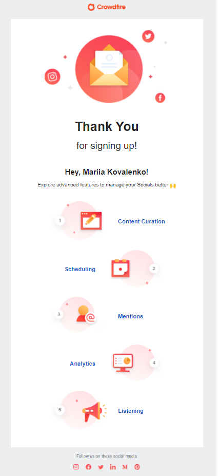
As you can see, visuals help structure the email better, dividing it into subsections leading to each of the Crowdfire’s features. There’s even no immediate need for CTAs – you just click on the respective links to learn about tools available to you.
Use case: Onboard a new client or subscriber.
Why we love it: It’s visually appealing and easy to navigate.
19. Buffer
If we’re talking about onboarding free trial users, the antithesis of the welcome email would be the end of the trial message. You send it when the free trial period is nearing its end to offer a prospect to switch to a paid plan.
Here, you can take several routes. For example, you can bet on personalized treatment and assign a free trial user their own sales representative to talk over the possibility of becoming a paying customer. Buffer uses this approach in the email below:
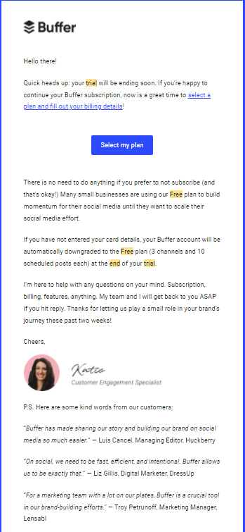
In addition to giving a potential customer a direct contact to use, the email also shares reviews from other customers to add up to the credibility of this email.
Use case: Notify the user about the end of the free trial.
Why we love it: This email takes a personalized approach, showing the company’s willingness to address each customer’s needs individually.
20. Tidio
You can also take a more actionable approach to inform a user about the end of the free trial. Apart from sharing a CTA button leading to the subscription plans, you can also walk the prospect through the main product features and perks they bring to the table:
If you need an example, take a look at this email from Tidio:
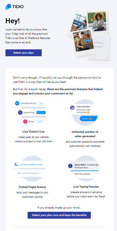
It doesn’t just include the list of benefits its chatbot solution can deliver. Instead, it goes through the data collected from the free trial period to see how their product has helped a customer improve engagement and conversion rates. Then, it shows these insights in the email to prove that their tool has actual tangible value.
Use case: Invite a free trial user to upgrade to the paid plan.
Why we love it: This email uses a data-driven approach to personalization.
21. Superdrug
Now, let’s switch over to the B2C marketing emails and look through some examples you can use as inspiration to launch successful email marketing campaigns. If you’re a B2B brand owner, keep reading, you might find these use cases pretty helpful, too.
Our first stop is at promotional emails. These messages are frequently used in B2C, especially by e-commerce companies. The reason is the same as for B2B – to boost sales, but B2C companies use these emails much more often.
You can promote your products in a wide variety of ways. For example, Superdrug sends out such messages every week under the Treat Thursday campaign:
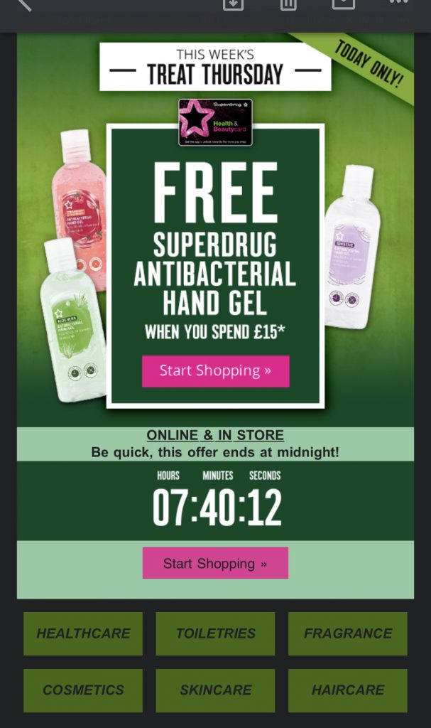
Basically, these emails come out every Thursday and contain a lucrative deal, which is, of course, limited (don’t forget, FOMO and email promotions often go hand-in-hand).
Such one-time deals are great for e-commerce businesses that want to increase revenue. It can also be a solid customer retention strategy, especially if you make a personalized selection of goods for the offer.
Use case: Boost sales via limited-time offers.
Why we love it: The offers in this weekly email are exclusive to Superdrug subscribers, which is great for customer loyalty.
22. Feather
Speaking about exclusive deals, you can also give your subscribers/customers a personal coupon to shop at your store. It can also be a discount on your services.
Take Feather, for example. It’s a company that rents out and sells furniture, so you can either buy a couch right away or rent it just to see if it fits your home design or not. For those who want to stick to rentals, Feather offers subscription plans, and this email gives an extra $300 off their first month with a personalized coupon:
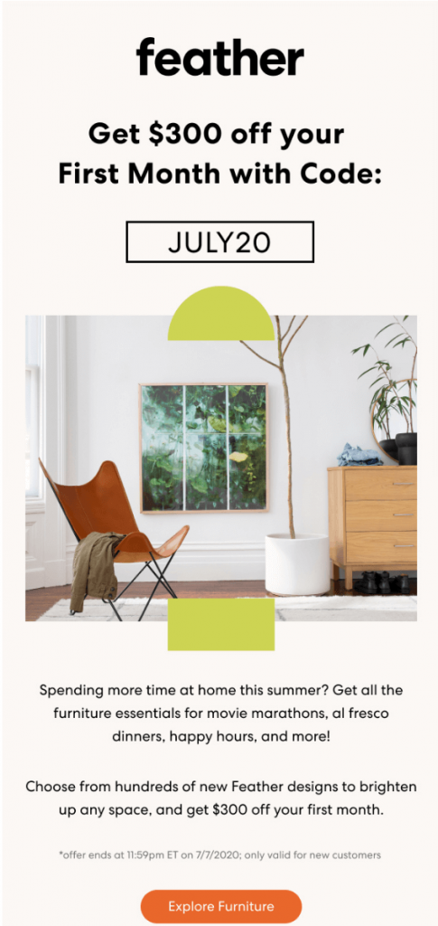
Coupons are another way of improving customer retention and loyalty. Besides, you can also use it as a strategy in your own email to re-engage dormant customers or leads with a lucrative deal.
Use case: Increase service subscriptions with an exclusive coupon.
Why we love it: This email doesn’t just provide a random code – it’s tailored to a specific customer need.
23. Brewbike
Remember the pre-registration email from Dribble? You can pull off the same trick and send an early-access email. Its goal is to attract the customer’s attention to the product early to increase sales.
Brewbike as a great email example of how you can warm up your customers with a product announcement:
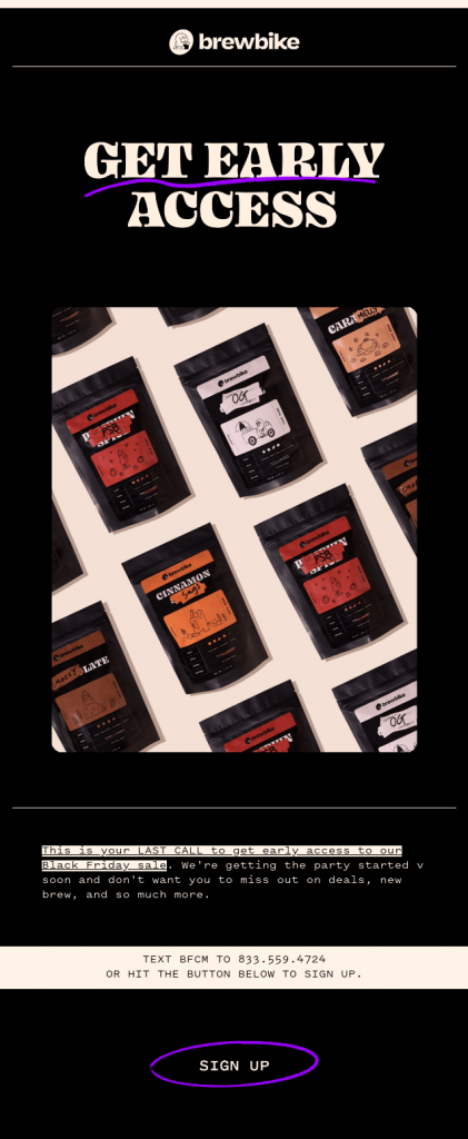
Of course, there’s a FOMO element typical for such promotional emails – the message indicates it’s the customer’s last call to get access to the product sale. There’s also an element of exclusivity – a subscriber learns about the sale days before other consumers.
Use case: Increase revenue during sales.
Why we love it: The brand thinks about its existing clients before anyone else, which can benefit customer loyalty in the long run.
24. Italic
Every e-commerce brand strives to sell a product to a customer, but it doesn’t always work out. Even if a consumer is interested in purchasing, different circumstances can impact their purchase decision at the last moment, resulting in cart abandonment.
Sadly, it’s not a rare occasion – many people don’t complete their purchases. According to Moosend, an average of 69% of carts are abandoned by users. To counteract this, businesses send out abandoned cart emails, which, as Moosend reports, have a 45% open rate. Not bad, huh?
So, what does a good abandoned cart message look like?
As simple and straightforward as possible. This message from Italic, an e-commerce shop, is a good example:
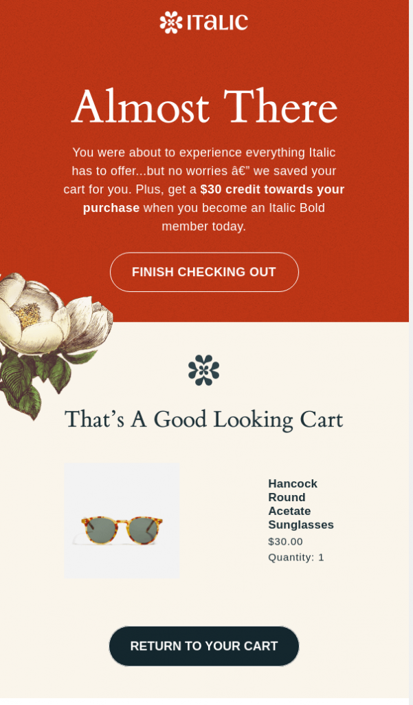
It’s a mere reminder that a person was about to purchase a product. Italic also adds encouragements, such as $30 credit if a person subscribes to their services. So, it’s a win-win – a consumer buys the product and gets an extra deal, and Italic acquires a customer.
Use case: Convert a dormant prospect into a customer.
Why we love it: Italic not only reminds about the abandoned cart but also offers something valuable in return.
25. Honey
Many consumers abandoned products in the cart simply because they couldn’t afford them at that time. So, if a product goes on sale, you can use this opportunity to reactivate dormant prospects and convert them into new customers.
This email from Honey is an excellent example of how you can bring this idea to life:
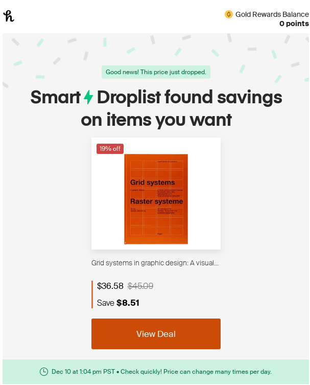
Indeed, Honey is an app that helps you find the best deal for the product you’re interested in throughout the internet. However, the idea behind this email is what every B2C brand can adopt – you recognize that a customer still needs the product but couldn’t afford it before. Now, when the product goes on sale, you prioritize their needs and notify them about the discount.
Use case: Reduce the number of abandoned carts through discounts.
Why we love it: Notifying about a discount for a product a consumer is interested in personalizes your offer.
26. Forever 21
A common approach to email marketing in B2C is to send a personalized email with customized offers. Basically, you do segmentation by previous purchase behavior to determine the types of products a customer could be interested in. Then, you use this data to put together an email with a tailored product selection.
Take a look at this message from Forever 21 – it showcases a set of different denim pieces, indicating that a subscriber might have purchased something similar from the brand before:
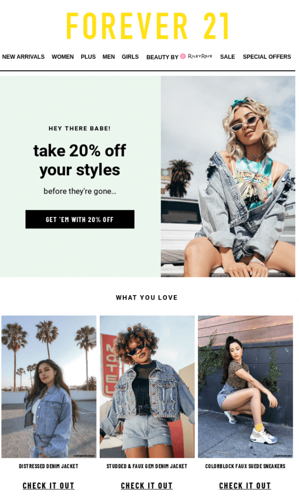
To give a subscriber a little push towards making a purchase, Forever 21 has also strategically placed the 20% discount. It’s hard to ignore such an offer.
Use case: Increase sales for specific items through a personalized product selection.
Why we love it: The email is well-structured and offers a good look at every suggested clothing item.
27. Uncommon Goods
Another excellent example of an email with personalized products comes from Uncommon Goods. Here, based on what the customer has previously purchased, the brand offers similar items for home sustainability:
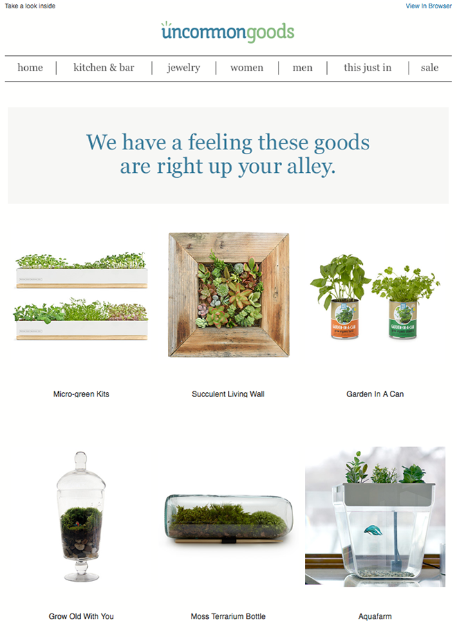
It’s worth mentioning that emails with individual offers will do much better than more common FOMO messages with discounts and limited-time offers. These emails make offers that are not intended for the mass market but are tailored to each individual customer, which positively impacts retention rates.
How can you improve this email?
You can finish it off with personalized CTAs, which, according to HubSpot’s research, have 202% higher conversion rates. So, if your goal is to increase revenue, go all out on personalization. Adding pricing for each item also helps a consumer make the purchase decision faster.
Use case: Boost revenue via product offers tailored to a customer’s needs.
Why we love it: This email provides a very specific selection of goods focused on what a subscriber is interested in.
28. Holo Taco
The final email we’re going to talk about is a product announcement message. Such emails often come in bulk to warm up the consumer’s interest and introduce the new product or collection.
Holo Taco is an excellent example of this email marketing strategy in action. The brand starts sending promotional emails one week before new nail polishes drop, one email every two days. For instance, these are all the announcements of the upcoming Winter Shimmers collection:

The first email from Holo Taco usually to warm up subscribers comes with a timer and a GIF giving a sneak peek of the new nail polishes:
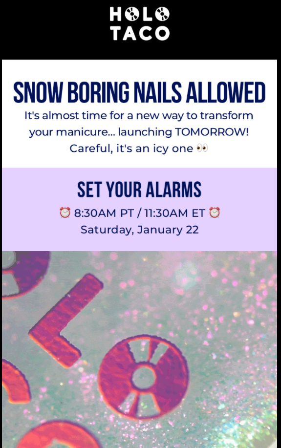
This email lets true fans of the brand know the exact date and time when the new collection drops, so they can get ready to purchase a limited craft box with new polishes.
However, the series of these emails doesn’t end with a follow-up product announcement message. Holo Taco also sends additional emails showcasing new nail polishes, often involving influencers to show off the products. As a result, you have an entire email marketing campaign.
Use case: Promote an upcoming product.
Why we love it: Holo Taco really invested in a comprehensive promo campaign that keeps a customer thrilled about the new collection.
Over to You
Phew, that was quite a ride! As you can see, emails can be very diverse, and you can go all out when putting together an email campaign. From onboarding to product announcements, you can let your creativity loose and craft messages unique to your brand.
However, there are three things you should do to improve email deliverability:
- Commit to personalization.
- Take user experience into account (design-wise).
- Don’t use overly promotional language, especially in the email subject line and header (it’s a ticket straight to the Spam folder).
Hopefully, our selection will inspire you to give email marketing a chance and start using it as a channel to attract more prospects and improve customer satisfaction and retention.
Interested in more articles like this? Keep reading our blog – we have many gems there!
Frequently Asked Questions (FAQs)
Got some extra questions about email marketing? We have all the answers.
Q1. What are some types of marketing emails?
There are many types of email messages, but here are the most common ones used in marketing:
- Onboarding emails
- Lead nurturing emails
- Newsletters
- Sponsorship emails
- Reactivation/re-engagement emails
- Transactional emails
- Product launch emails
- Email notifications
Q2. Is having an email marketing strategy important?
It absolutely is. First of all, it’s a way to support multi-channel marketing that benefits brand awareness. Apart from that, some consumers prefer communicating with businesses via emails over any other channel. Finally, 4 out of 5 marketers say they’d rather give up social media than email marketing, so that proves how important it is.
Q3. Is email marketing popular?
Email remains one of the most popular digital marketing channels, with 82% of marketers using it to promote their brands (based on Statista’s report from February 2020).

Mariia is a content strategist and editor at Digital Marketer’s World. She is passionate about educating others on all things marketing and believes in the power of the written word.
