11 Email Newsletter Best Practices to Follow in 2023
So, you decided to add newsletters to your email marketing strategy.
That’s a smart idea. After all, 81% of B2B businesses wouldn’t name newsletters their top content marketing strategy if they didn’t bring any results, right?
However, the popularity of this email type is also its biggest curse – if so many companies are already using it, how in the world can you make yours stand out?
Indeed, before you put together your newsletter, you need to think it through, starting from the subject line and ending with every CTA button in your letter.
Sounds like a daunting task?
No worries, we’ve prepared the list of eleven best practices and email marketing tips to guide you through the entire process.
Let’s dive in!
1. Use an Engaging and Concise Subject Line
What would you want to see in a newsletter subject line?
We bet something that addresses your interests and offers something unique. And, if you succeed at that, InvespCRO says an average of 47% of recipients will be likely to open your email. But, at the same time, this very resource claims that the word newsletter in the subject line decreases open rates by 18,7%.
So, what should you do?
There are a few general recommendations to follow if you don’t want the subject line to be the reason your letter gets spam complaints:
- Mind the length. Campaign Monitor, in its research, came to the conclusion that an optimal length of a subject line should be around 41 characters. Otherwise, you’ll end up with a never-ending header, like in this example:

- Beware of spammy words. If you think that words like amazing, brand new, certified are harmless, we must disappoint you. According to Inc., these and many other words increase the chances your email will end up in the spam folder.
- Consider adding emoji. One study analyzed over 9K email campaigns on mobile and found that subject lines that included emojis increased email open rates by 1,071% on Android and by 662% on iOS.
If you’re worried that a subject line is too vague, consider adding preview text to fuel the recipient’s interest in opening the letter.
Example: Later
One of the standard practices in newsletter email subject lines is to ask a question. In fact, Yesware investigated this method and came to the conclusion that such headlines have 10% higher open rates.
Why does this approach work?
It capitalizes on our curiosity. If the question is open and leaves room for interpretation, it pushes us to find the answer as soon as possible to satisfy our natural desire to learn.
How should this tactic look in action?
Take a look at this newsletter from Later. Knowing that its target audience wants to learn as much as possible about social media marketing to stay ahead, they ask a question their readers want to know the most – what’s in store for them in terms of social media trends in 2022?
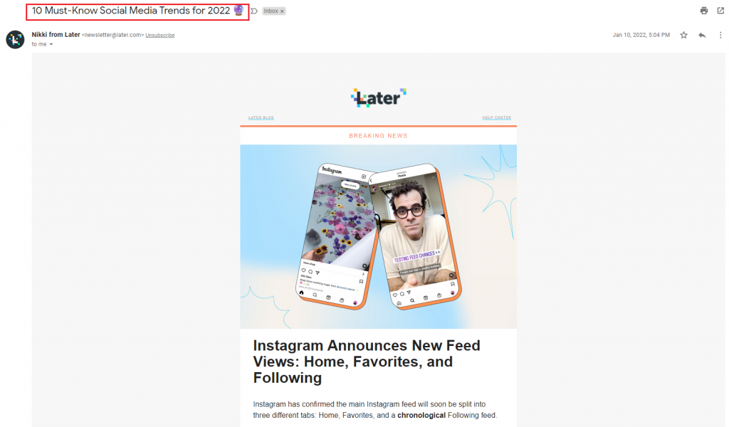
Surely, Later doesn’t just answer this question in the message – there is other news as well. But if you ask a question in a subject line, there must be an answer somewhere in your newsletter. Otherwise, you’re just click-baiting your subscribers.
2. Build an Engaged Email Newsletter List (with a Double Opt-In)
The goal of a newsletter is to inform email clients about the latest news in a particular industry. Of course, it takes time to put together such content, so it’s natural for you to expect decent feedback showing that people value your work.
However, what you might not realize is that the level of engagement your subscribers show depends on the effort you’ve put into creating a newsletter list.
So, how can you make sure you’re targeting people who are genuinely interested in receiving news from you?
Double opt-in is the best solution here. Essentially, it’s a method used during email marketing campaigns where the subscriber first fills out the signup form (e.g., for a newsletter) and then receives a welcome email with a link, which they need to click to consent to receiving emails from you.
So, you can already see the benefit of this tactic: if a person confirms they indeed want you to send them newsletters, you get a highly engaged subscriber. Having a mailing list like this improves your sender reputation and positively affects email deliverability.
It’s important to note that double opt-ins are required by the CAN-SPAM act, much like the unsubscribe link that should allow any newsletter subscriber to opt out at any time.
Example: SocialBee
Here’s how you execute double opt-ins in practice.
When a potential subscriber comes to your newsletter signup page, you should provide them with a contact form. Typically, it doesn’t contain anything but the request for their email address. SocialBee, a social media marketing platform, also adds the headline indicating the value their newsletter promises to deliver:
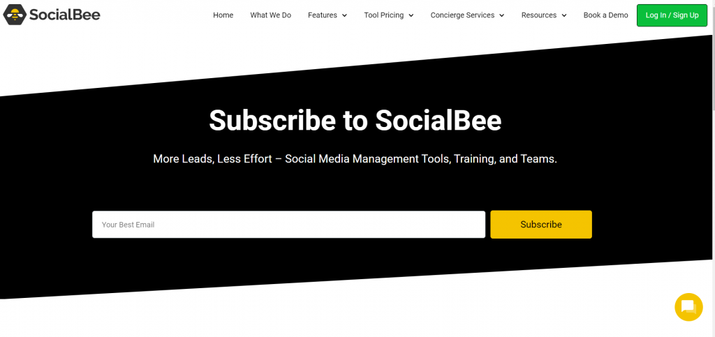
Next, you send the new subscriber the confirmation email right after signing up. SocialBee’s message is simple but on-point with the company’s branding strategy. Take a look:

As you can see, the link is duplicated in the letter to make sure that everything works for the mailing list member.
What if the subscriber ignores the email?
The best practice is to send another one (your previous message could get into spam, for instance). If your efforts remain ignored, that’s your queue not to pursue this subscriber.
3. Set the Right Expectations (by Letting Subscribers Know What They Should Expect from Your Newsletter)
People get more and more reluctant to share their email addresses. For instance, back in 2019, only 54% of people said they would give their emails to someone, and this number was down 7% compared to the 2018 results.
The reason for such behavior is simple – people don’t want to get their mail overstuffed by something irrelevant, especially if they have multiple Gmail inboxes – can you imagine the mess? They don’t want to be bombarded by spam, and that’s normal.
But, in the wake of this attitude, what should you do to get people to subscribe to your newsletter?
There’s a very informative piece on the MarTech website published by Jeremy Smith in 2015. It highlights the importance of different psychological tricks that work when asking for an email address, and one of them is to answer the subscriber’s question, “What’s in it for me?”
To do that successfully, you first need to answer the following questions:
- Why did a particular subscriber come to the newsletter landing page?
- Which of their biggest problems do they expect your newsletter to solve?
- What are other points of value they expect from subscribing?
Essentially, you shouldn’t just invite someone to sign up; you should tell them why they need it and what they will gain from it. The practicality of this action should be evident to them.
Example: Digg
To set expectations, you need to outline the perks it delivers on the subscription landing page. Digg has an excellent example of this strategy in action:
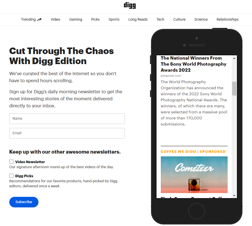
As you can see, this page doesn’t just invite you to subscribe; it gives you an extended answer to what you should expect from the newsletter, namely:
- What it offers
- When the subscriber will get it
Apart from that, Digg offers extra add-ons to the newsletter, but you can opt out of them if you are not interested. It’s a really good example of a level-headed approach to creating a signup landing page.
4. Add Personalization Elements
Now, let’s talk more about how to make your messages stand out in the recipient’s inbox. After all, a person receives 121 emails a day on average. So, imagine how competitive this playing field is?
Your lucky card is personalization, of course. However, you need something more substantial than just first-name personalization (although it’s still important). Here are a few practices you can follow:
- Commit to segmentation. According to Campaign Monitor, segmented emails have a 58% higher performance than non-personalized ones, no matter whether their goal is to drive the conversion rate or deliver news to the subscribers. So, study your audience’s behavior patterns. This way, you’ll have a better understanding of what a particular segment group wants to see in their newsletter.
- Pay attention to the subject lines. Here, besides addressing the recipient by name, you can also highlight their interests and appeal to their needs. However, make sure to keep the headline short.
- Give recommendations. Use behavioral triggers to customize your newsletter to a specific group of subscribers.
- Celebrate milestones. It can be a particular achievement your company has reached, and you can use your newsletter to acknowledge the subscribers’ contribution to your accomplishments. This is also a subtle method to personalize your email.
- Put a face to your company. You can choose to send a newsletter from a corporate email or add a name and a picture of your team member responsible for email marketing.
As you can see, there are many more ways to personalize your letter other than calling a subscriber by name. If you commit to personalization, it will not take long to see an increase in deliverability and open rates.
Example: Klaviyo
Here’s an email newsletter demonstrating the last bullet point we mentioned before – sending an email from a person, not a company. Klaviyo’s managing editor Katie Tierney addresses each subscriber before introducing the topics covered by the email, creating a personal connection with each recipient:
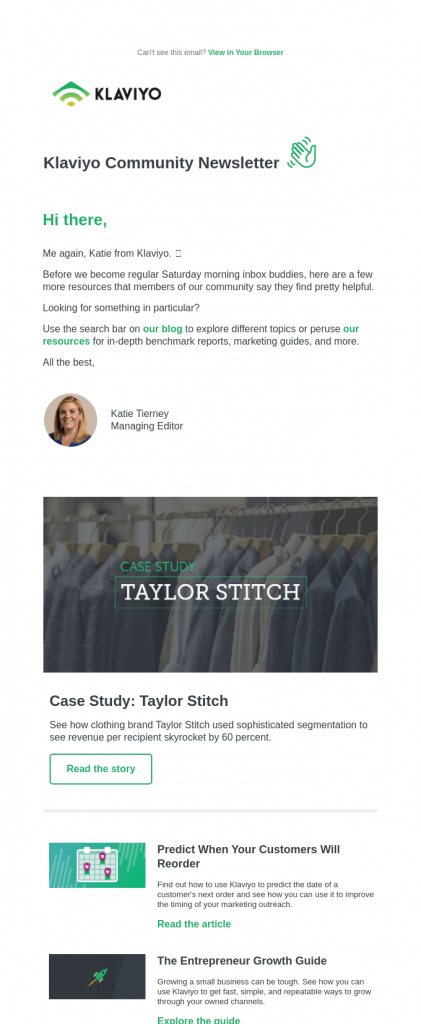
If you take a closer look at this example, you’ll see that there’s another personalization tactic applied here. All the picks in the newsletter are put together based on what Klaviyo’s community deems valuable and interesting to read. In other words, the company used behavioral triggers to optimize its newsletter.
5. Optimize Your Newsletter Design
When we discussed examples for different types of emails in one of our previous articles, we mentioned the importance of email design in increasing functionality and helping break down your message and make it more digestible.
Whether you’ll be using a newsletter template or building the one yourself, it needs to follow these best design practices to make sure the recipients actually enjoy reading it:
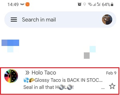
- Don’t disregard your preheader. First of all, it will appear as an extension of your subject line in the subscriber’s inbox. Secondly, it sets the tone for your entire message. Here’s a quick example of an engaging preheader text from Holo Taco:
- Bet on a branded design. Use the colors and fonts typical for your brand to make sure the newsletter is associated with your business. This way, you’ll also make your company more memorable.
- Use user-friendly design layouts. The best one is called the Z pattern – its goal is to push the reader to read through your entire email using a specific positioning of text and eye-catching visuals.
Of course, you can’t forget about call-to-action buttons. However, be careful not to overstuff your newsletter with CTAs. As we mentioned in our email metrics piece, one call-to-action is already enough to drive click-through rates.
Example: The Restaurant
Let’s talk more about that Z pattern we briefly mentioned earlier.
Essentially, this pattern capitalizes on the natural way we move our eyes when reading the text. You can use this method for languages with left-to-right and right-to-left scripts – the Z pattern is still preserved in both cases.
Take a look at this example from The Restaurant to see what we mean:
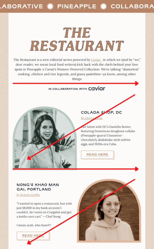
As you can see, the text follows this pattern and then changes into a picture and to the text again. This way, the reader actually reads through the entire email and pays attention to every element. It’s a perfect design solution for a newsletter.
6. Maintain Stylistic Consistency
The design makes your newsletter memorable, and so does the flow of content in the body of your email. The way you organize the text also helps your readers associate your newsletter with you, so always be aware of how you phrase your message.
There are a few common stylistic rules to follow when it comes to writing newsletters:
- Short sentences and paragraphs. The average attention span of an adult is about 25 minutes, but your readers definitely don’t want to spend as much time reading your newsletter. So, keep it concise and informative.
- Greet the subscribers appropriately. Try to stick to the same way of greeting your newsletter recipients and be respectful.
- Try to avoid jargon. Unless your email newsletter is created for readers from a very specific industry (manufacturing, for instance), try not to use slang. Colloquialisms are a no-no too.
- Think twice before using humor. Consider your audience – if it includes people from different cultures and backgrounds, your joke may be perceived differently, and there’s a chance some people won’t appreciate it.
What about emoji?
Previously, we mentioned that you can use them in subject lines, and the same goes for the content of your email. However, common email marketing tips often say not to overstuff your email with symbols and do not substitute words with emojis. What will happen if they won’t display properly in the subscriber’s inbox? Your newsletter will just look weird.
Example: Moosend
Engaging copywriting is definitely the skill you need to maintain the unique style of your newsletters, and Moosend is a great example of how this skill should be applied in practice.
Let’s take the company’s last year’s holiday newsletters. This one was sent right before Helloween:
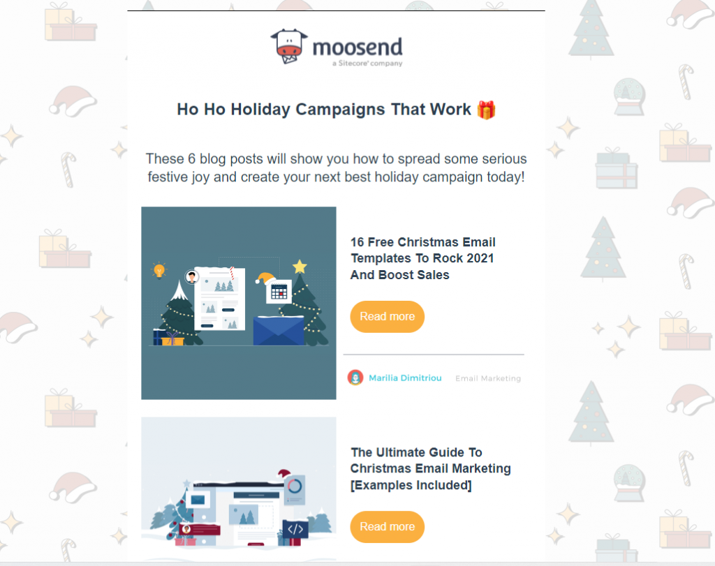
Notice how the company uses puns, play on words, and catchy phrases to attract the reader’s attention. They took the same approach in their Christmas newsletter:
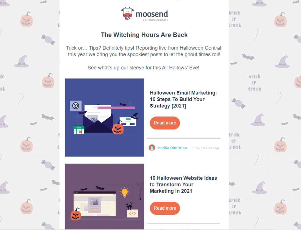
This is a perfect example of how to maintain stylistic consistency – over time, it becomes a ‘thing’ that characterizes your brand and helps a consumer differentiate you from your competitors.
7. Use Several Types of Content Formats
Today, it’s hard to imagine an email newsletter without any visuals. But if you’re convinced that your emails will do just fine without images and videos, here are some stats from Snov.io to prove otherwise:
- Using a video in an email increases its open rate by 19%.
- 54% of email subscribers prefer receiving messages with videos.
- Two-thirds of people say they like emails consisting only of images.
- Messages with some sort of graphics have a 27% higher open rate.
At the same time, 47% of recipients read emails with images turned off, and it might be a point for concern raising the following question – what is the best proportion of text to visuals in a newsletter?
The best approach is 80% text to 20% visuals. This way, your subscribers won’t have any trouble loading your newsletters either on their desktops or mobile devices. If you’re within that limit, you can include GIFs, images, videos, or anything that email recipients will find engaging and valuable – just make sure to test the loading time of your email first.
Example: GasBuddy
There are a few rules you need to follow with visuals in a newsletter:
- Relevancy – do not add images that do not have any relation to the message you want your email to convey.
- Size – each image should not be more than 1 MB, and the resolution should not be lower than 72 PPI.
- Formats – the common include JPEG, PNG, and GIF.
- Clickability – make images clickable to increase your newsletter’s interactivity.
- Alt text – it will appear instead of an image if it fails to load.
- White space – don’t overstuff your letter with images; leave room between the elements.
This email from GasBuddy is an excellent example of all these rules applied in practice:
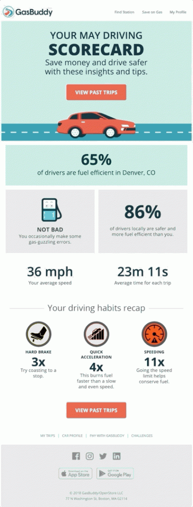
Essentially, this newsletter/update is an infographic displaying each subscriber’s monthly achievements through visuals. It’s not overstuffed with CTAs, and the visuals perfectly complement the text. This is an excellent example proving that you don’t need to overstuff your email with visuals to make it more engaging.
8. Start Doing A/B Testing
We already mentioned here and there that you need to test email newsletter before sending. A/B testing is the best approach for this, as it allows you to see how different segments of your email list respond to your message.
How does it work?
Basically, you send two different variations of one email to two different subsets of your subscribers. The ultimate goal is to determine the variation that showed the best performance.
It’s possible to either test two entirely different versions of one message or its elements, including:
- Subject lines
- Visuals
- Call-to-actions
- Links
- Offers
- Word order
- Length
- Personalization
- Copy
- Tone
- Style
Before you send emails for testing, it’s crucial to have a clear understanding of the outcome you expect. If you want to increase open rates for your newsletter, you need to study the historical data on this email marketing KPI and decide what you want to improve (email automation and marketing tools will help you here).
When the results come in after four or five days, make your choice not based on the impression you get from it but on the data you receive. Gut instinct is not a reliable factor here.
How often should you run this test?
Ideally, before every campaign and as often as possible.
Example: The Skimm
newsletters from the same company improved over time.
Take The Skimm, for instance. It’s known to deliver daily news updates, and its approach has changed over the last couple of years.
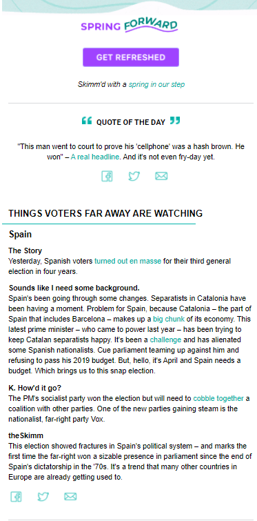
For example, back in 2019, The Skimm was more concise about delivering the latest news, the text was visibly shorter, and if you wanted to learn more, you needed to click on the link to the source:
Fast forward to February 10, 2022, the company decided to tweak its approach and started to write more lengthy reportages and added white space between the paragraphs to improve readability:
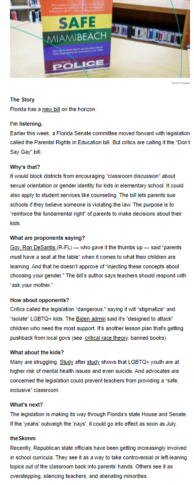
Obviously, TheSkimm optimized its newsletters after a series of tests showing that its readers don’t want to click on the links but want to get all the news within one email.
9. Make Sure Your Newsletter is Optimized for Mobile
Which device do you typically use to check your emails?
Statistics show that most email opens (60%) are now coming from mobile devices. On top of that, HubSpot reports that 35% of professionals from the B2B industries check emails on their smartphones.
So, this leads us to the natural conclusion that it’s important to optimize your newsletter for mobile devices. But how do you do that?
Here are a few must-follow practices you should consider:
- Choose responsive email templates. Such newsletter templates should automatically adapt to every screen resolution.
- Don’t pick ‘heavy’ images. Your message shouldn’t take too long to upload. The format also matters, and we recommend using JPEG because such images preserve their quality even when reduced to a smaller size.
- Do not add navigation bars. Such elements are usually unnecessary for reading newsletters on mobile devices, but they add extra weight to your emails.
- Make the CTA button visible. However, don’t overstuff your message with call-to-actions – one at the top will do.
- Think about text distribution. There’s a chance you’ll need to reduce the number of characters in the mobile version of your newsletter for the sake of readability.
There’s one more thing you can’t forget about, when optimizing your newsletter for mobile – testing. After all, there’s simply no other way to know that your message is mobile-friendly.
Example: HubSpot
HubSpot proves that there’s no need to go crazy with the design of your newsletter – even a combination of a simple image and a readable text is enough to deliver the most critical industry news:
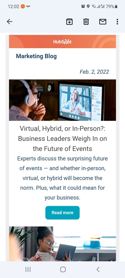
Speaking about images – HubSpot added JPEG pictures here, and they did not lose their quality, proving what we’ve said about this format before.
10. Include a Call-to-Action (CTA)
The importance of call-to-actions in email newsletters is obvious – they guide the reader to the pages where they can learn more about the topics briefly mentioned in the email. In most newsletters, CTA buttons serve primarily educational purposes.
However, putting a whatever button in the message in hopes that the reader will click on it is not enough. You need to carefully think through both the text and the design of your CTA.
Here are a few essential points you should keep in mind:
- Tie your CTA with the goal it should pursue. If you want the reader to click on the button to read more news, the CTA should reflect that. In other words, it should say exactly what you want the recipient to do.
- Mind the language. It should be straightforward but not in-your-face. The CTA should also be connected with the text.
- Utilize white space. It helps the CTA button stand out.
Here are also a few good practices about designing the CTA from the research by Really Good Emails:
- Average size – 47.9 pixels
- Color – 48% of companies choose the colors of their brand
- Shape – buttons with rounded ages occur 54% of the time
- Frequency – an average email contains roughly two CTA buttons
- Placement – the top 3rd of the email
- Characters – no more than 14
Remember – a good CTA does not impose the action on the reader but encourages them to click on it because the recipient will receive more value by doing so.
Example: Haus
Let’s say your newsletter contains several offers. What should you do in this case?
The best approach, of course, is to break down the letter into separate sections for each offer and then assign a relevant CTA to each of them. Here’s an excellent example of this approach from Haus:

The first part of the email offers a recipe, so the CTA button mirrors that. The same is with the second section – it shows Haus’s take on the classic Paloma cocktail with the list of ingredients the recipient can buy by clicking on the Shop Now button. This is how you keep CTAs clear and relevant without overwhelming the reader.
11. Share Relevant and Valuable Content
Finally, you need to commit to creating high-value quality relevant content for your newsletter from the start. We mentioned this point here and there, but it’s crucial enough to repeat it over and over again – the engagement rate of your subscribers directly reflects how appealing your email content is.
Obviously, to create more relevant and valuable newsletters, you need to study the data from your subscribers, analyze their behavioral patterns, and use this information to deduce what offers they would like to see.
At the same time, you might be tempted to insert a few ads in your message. This approach can be helpful, especially if a particular segment of your subscribers receives your newsletter but hasn’t purchased anything yet.
However, note – newsletters are mostly informational in nature – they exist to update on the latest news and share tips. Newsletter recipients primarily look for the educational value relevant to their interests. So, if you decide to put ads in your message, make sure they do not overshadow the information you’re trying to deliver.
Example: Moment
Moment is a marketplace for photographers that has a newsletter that shares works of different artists. The main goal of these messages is to share inspiration. In these newsletters, the company actually shares an interview with the photographer of their choice, sharing their personal take on different techniques, such as portraiture:

The value of these letters is clear – to create a learning moment for subscribers and open their minds to new photography experiments.
Moment also managed to include ads in its newsletter:
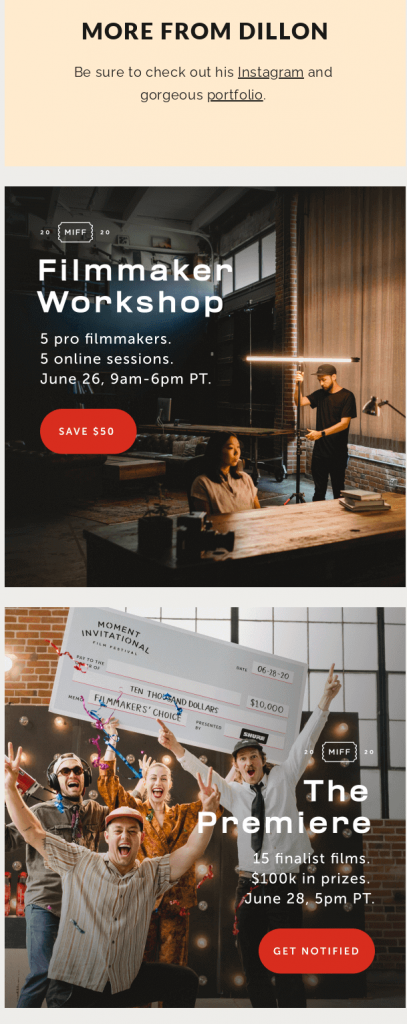
All of them are located at the bottom of the email, but the most crucial point here is that all of them are connected to helping the subscribers become better at photography, filmmaking, and producing. So, they are not spamming the recipient but rather encouraging them to become like the artist they interviewed for the newsletter.
Now Over to You
Phew, that was a lot, huh? But think about it – now you know how to create an awesome newsletter that will deliver more engagement and fewer unsubscribes.
Now, let’s recap the best email newsletter practices we’ve learned today:
- Always pay attention to the subject lines – they are the gateway to better open rates.
- Include double opt-ins to make sure your email list consists of highly engaged subscribers.
- Tell people what to expect before they sign up for your newsletter.
- Don’t go cheap on personalization – it’s the key to keeping subscribers interested.
- Be mindful of email newsletter design – it should highlight your message, not overshadow it.
- Maintain stylistic consistency – your newsletter should be in tune with your branding strategy.
- Don’t be afraid to experiment with content formats, as long as they don’t make your letter “overweight”.
- Commit to A/B testing – you can either test the entire message or different elements separately.
- Make your newsletter mobile-friendly – use an appropriate template that will help it load on different devices.
- Keep call-to-actions relevant – they should reflect the action you want the subscriber to perform.
- Focus on creating valuable newsletter content – it should inform and educate the readers.
Hopefully, our tips and newsletter ideas will help you step up your game. And, if you want to become even better at email marketing and digital marketing in general, check out our blog – there are quite a few guides there!
Frequently Asked Questions (FAQs)
Here are a few common questions we often get asked about creating newsletters.
Q1. What makes a newsletter effective?
An effective email newsletter is informative and relevant. It should appeal directly to the subscriber’s interests and cover the topics from the industry they belong to.
Q2. What are 5 important elements of an effective newsletter?
Here are five main characteristics you need to consider:
- Focus on the reader’s interests
- Concision
- Storytelling
- Design
- CTA
Q3. What should be included in a newsletter?
You can add different elements to your newsletter, including promotions, ads, coupons, referral codes, product announcements, a link to the webinar, etc. However, make sure they don’t overshadow the informational content that should be the main point of your email.
Q4. How often should you send a newsletter?
The ideal frequency is once a week/month. Don’t send your newsletters more often than twice a week. However, make sure to run some A/B tests to find out the frequency your subscribers are comfortable with.
Q5. How can newsletters be distributed?
You should build a subscriber list first and test it to make sure you have highly engaged recipients. Then, you can start sending them newsletters via an email service (Gmail, Yahoo, etc.).
Q6. How long should email newsletters be?
The perfect length is no more than 20 lines of text. In terms of the word count, keep your newsletter no longer than 200 words.

Mariia is a content strategist and editor at Digital Marketer’s World. She is passionate about educating others on all things marketing and believes in the power of the written word.
