19 Fabulous Email Newsletter Examples to Nail Email Marketing
How many newsletters are you subscribed to?
Probably, quite a few. But how many of them do you actually read?
That’s the issue with newsletters. They seem to be very important as they share updates, keep you in the loop about any product changes, and notify you of crucial industry news. However, since these emails are often so heavy with information, it impacts the readability and engagement they deliver.
But does it mean you should give up on newsletters because of the possibility that people won’t read them?
Of course, not! And to prove this to you, we’ve compiled a list of 19 best email newsletter examples that will stand out in your email marketing campaign.
5 Elements Great Newsletters Should Have
Before we jump into our pool of examples, it makes sense to discuss what makes a newsletter ‘fabulous’.
In general, it’s always a smart idea to create a newsletter with the end-user in mind. People don’t want their inboxes to be cluttered with junk. And, if an average person receives 120 emails on a daily basis, they will send your email right to the trash folder if they find it irrelevant. So, it’s essential to apply different approaches to draw the subscriber’s attention.
Let’s discuss these approaches. We already shared most of these best practices in our previous article, along with some examples, but let’s quickly review them one more time.
Element #1: Strong messaging
Even though newsletters usually cover a variety of topics, from the latest company news to product and industry updates, they still need to deliver a clear and consistent message.
What does such a message entail?
According to researchers at the University of Connecticut, if you want to communicate a certain point to someone and make sure they understand it, it’s crucial to observe the following elements:
- Opportunity – the message should be tied to a specific occasion. Otherwise, it will be out of context.
- Purpose – the recipient should understand what to do with the information you want to share.
- Audience – the message should take into consideration the needs and interests of the recipients you’re targeting.
- Structure – there should be a visible distinction between the primary and secondary parts of a message.
- Tone – it should reflect your overall branding strategy and how you usually communicate with your target audience.
We think it also makes sense to add timing as an essential factor in delivering a high-quality newsletter. You might have the most informative email for your subscribers, but if they receive it at the wrong time, it’s likely to get lost in the myriad of other messages they get every day.
Element #2: Engaging visuals
Surely, you can create a newsletter that’s just a portion of the text describing the latest news you want to share. Besides, you don’t really need anything else other than text to deliver your message, right?
Hardly. Even though studies show that the average attention span of a newsletter recipient has been increasing over the years, it’s still not enough to read through a newsletter, many of which can be up to 200 words.
So, it makes sense to break down your message using different visual elements. They can include GIFs, videos, infographics, graphs, and any other email content that could help improve the comprehension of the text.
However, there are a few golden rules to follow if you want visuals in your newsletter to work for your benefit:
- Follow the proportion of 80% text to 20% visuals.
- Opt for the JPEG format – it preserves its original quality when you change the image size.
- Don’t use visuals that are over 1 MB. If you use heavier images, you risk getting the following result:
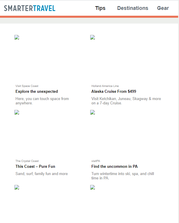
- Always add alt text – it will appear instead of a visual if the recipient has images turned off when reading emails.
We’d also like to add that it’s a good practice to make visuals clickable. This way, they become an integral part of your message and add to your newsletter’s value.
Element #3: Content optimized for mobile
Today, creating a mobile-friendly newsletter is no longer a choice but a requirement. Think about it – around 1.7 billion people read emails on their mobile devices, compared to 0.9 billion that use desktops for this task.
Creating newsletter content optimized for mobile means making it responsive. Here are a few quick tips on how to do it:
- Mind text length. For instance, the subject line should be no longer than 40 characters. Also, mind the number of words in the CTA button – if you make it too long, it might not display properly on a smartphone.
- Use a responsive template. Pick email templates that work well both for desktops and mobile devices.
- Don’t skip the pre-header. It gives mobile users a sneak peek of what your message is about.
- Utilize white space. It will help the better perception of the information in your newsletter.
Obviously, every email sender has different settings for mobile versions of emails. That’s why it is essential to test your newsletter before sending it.
Element #4: Clear call-to-action (CTA)
What do you want a recipient to do after reading through your newsletter? Sign up for a free trial? Buy access to the upcoming webinar? Or simply check out the latest product updates?
Whatever it is, you should tell them precisely what you expect them to do, and the CTA button is what will help convert the reader.
So, to reiterate, if you want a subscriber to perform a specific action, the CTA button should tell them about it. However, it’s not always enough for them to actually do what you want them to.
To maximize the impact of the CTA, you need to follow these practices:
- Choose the color wisely. According to Really Good Emails, it should correspond to the traditional colors used for branding to achieve consistency.
- Pay attention to the button’s size. It should not be taller than 47.9 pixels (according to the above-mentioned source).
- Add clear CTAs. According to Campaign Monitor, a newsletter version for desktop can have up to four CTA buttons, while for a mobile version, it’s enough to add one or two.
The placement of the CTA button also matters. For a mobile version, try to put it at the top for better visibility and click-through rates.
Element #5: Personalization
Finally, you can’t talk about creating a high-quality newsletter without mentioning personalization. Your subscribers, who already have their inboxes full of irrelevant stuff, will not hesitate to send your email to the spam folder if it doesn’t answer their needs.
So, what does newsletter personalization involve?
First and foremost, it’s all about segmentation. When you study the behavioral patterns your subscribers have shown over a certain period of time, it will be easier for you to single out their needs and tailor your emails accordingly.
Personalization should be present in every element of your newsletter, from a subject line to addressing each subscriber by name in the introduction. CTA buttons should also contain personalization elements. In fact, such call-to-actions perform 202% better when it comes to click-through rates.
Now, it’s time to go over our newsletter examples and the use cases they present to inspire your email marketing strategy.
1. Under Armour
Since we finished our previous section talking about personalization, here’s a great example of how you need to approach it.
Under Armour sends various emails to its subscribers, including newsletters with different product picks. However, they don’t just add them to the message blindly – they use email list segmentation to deliver a more tailored offer.
For example, in the newsletter below, you will see a selection of men’s clothing items specifically picked based on the subscriber’s previous purchase patterns. Besides, you will also notice a personalized subject line stressing that the choices in this offer were made for a specific recipient:
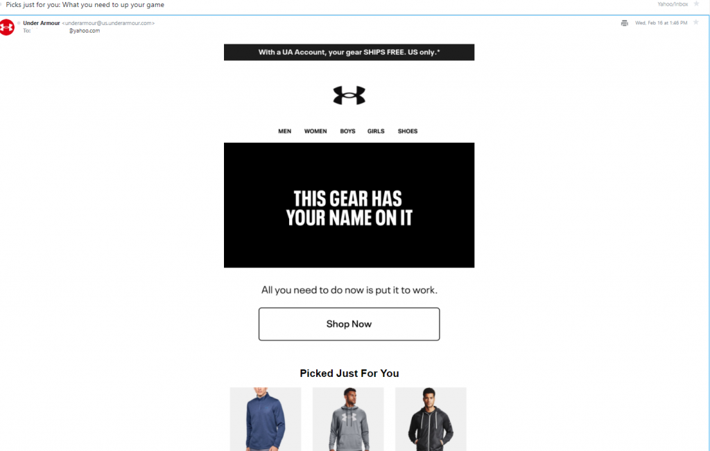
Since it’s a newsletter from an ecommerce company, it doesn’t require much text. However, it also plays into the brand’s hands, as the reader’s attention goes straight to the clothing items offered. You will also notice a single CTA, which is sufficient – the images of the clothing items do the job of convincing the customer to convert, and the CTA button is just there to seal the deal.
Use case: Convert a subscriber by making a personalized offer.
2. StitchFix
When we briefly talked about subscriber list segmentation, we mentioned the importance of tracking patterns in purchase behaviors. Sometimes, these behaviors don’t reflect the given recipient’s needs per se, but they can show what people from their circle might need.
Need an example?
Consider this newsletter from StitchFix. Obviously, the brand picked up the subscriber’s previous purchase or browsing history and assumed that they might want to buy more kid products since they’ve shown such interest before:
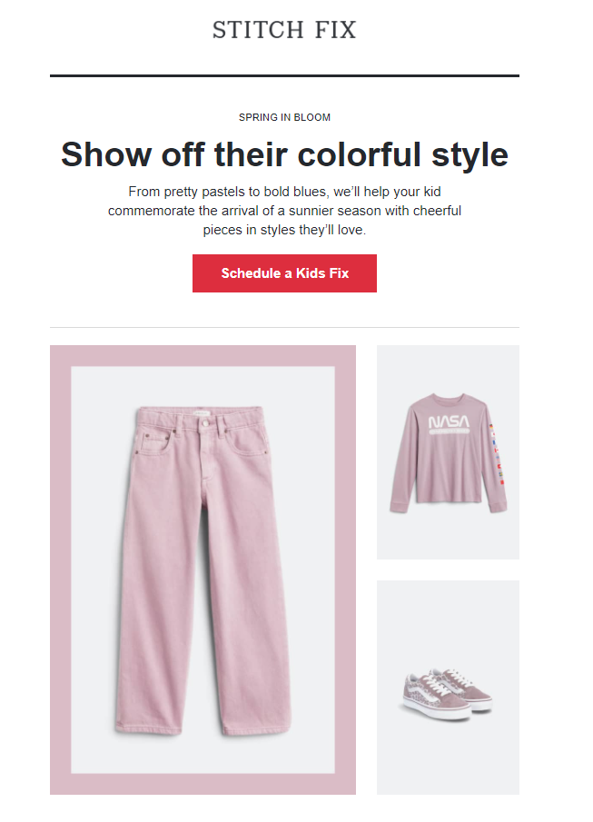
What’s even more interesting is that the brand emphasizes the colors that will be trending in the spring of 2022, playing on the idea of how important it is for teenagers to dress up in trendy clothes to stand out from the crowd.
So, here you have it – a mix of a personalized offer based on previous purchase patterns combined with a little bit of psychology.
Use case: Increase sales by offering a personalized product selection triggered by previous purchase patterns.
3. H&M
In general, many ecommerce companies dedicate a portion of their newsletters to upcoming trends. This way, they take care of their readers who might be too busy to follow these innovations themselves. By the way, this tactic is not just for B2C businesses; a B2B company can do the same with its newsletter.
However, since we’re talking about ecommerce, here’s an excellent example from H&M showing how to introduce an upcoming trend to the reader:
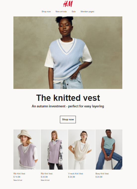
This newsletter is dedicated to the fall knitwear trend, which was hot in September-November 2021. Below, the reader will find H&M clothing pieces (along with pricing) that follow this trend for inspiration and, maybe, for a future purchase.
Notice that this newsletter doesn’t impose anything on the recipient. Instead, it simply introduces the new tendency in clothes and leaves the choice to the subscriber.
Use case: Increase the number of orders by targeting industry trends your readers are interested in.
4. Penguin Random House
We talk about personalization here and there, which is mostly concerned with the subscriber’s needs and interests. However, personalizing a newsletter doesn’t end there.
One more way you can add a personal touch to your emails is by introducing the content in them from the first person. For instance, brands often use the name of their employee responsible for email marketing in the subject line and email signature to introduce a message.
However, you can go even further and make your entire newsletter a collection of personal recommendations from someone reputable in your company. It can either be the CEO, the head of marketing or, in Penguin’s case, the creative development lead:
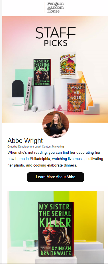
In fact, the company’s newsletters contain personalized recommendations from different employees. In the email above, Abby Wright shares her favorite books along with the reasons why she likes them to motivate newsletter subscribers to read them as well. It’s an excellent way to build a personal connection with the newsletter recipients. However, this is not the only benefit.
By featuring your teammates in a newsletter, you also promote employee advocacy, which is great for your digital marketing strategy. Think about it – brand messages get reshared 24 times more frequently when distributed through employees. So, it’s a win for you on all fronts.
Use case: Improve newsletter personalization and strengthen your branding strategy by featuring company employees.
5. HuffPost Morning Email
Alright, it’s all clear with ecommerce newsletters – they need to heavily rely on personalization since their primary goal is to sell. But what if the main task of your message is just to deliver the news?
No worries – you have plenty of options here. We’ll start with an example from the Huffington Post.
Since it’s a news outlet, HuffPost sends a daily newsletter every morning to update its subscribers on the latest news across different niches and industries. The message is divided into several sections – Top Stories, Coronavirus Updates, quick updates on various topics, and a selection of news to wrap up the email.
However, what’s even more interesting is how HuffSpot approaches each news piece:
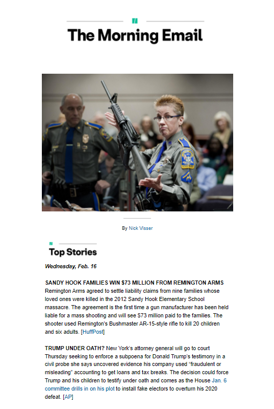
As you can see, the round-up of each piece is concise, giving only the key details of each story. This is a very smart move since HuffPost’s target audience has a limited time in the morning to get familiar with all the updates (that’s why it’s called Morning Email). Nevertheless, for those who want to learn more, HuffPost shares links to the full version of each story.
Also, it’s worth mentioning that HuffPost’s email is a classic text newsletter – you won’t find many visuals in it. However, considering its primary goal, there is no need to overstuff it with images.
Use case: Boost engagement by providing top industry news in a brief and concise manner.
6. TheSkimm
The following newsletter, which we also mentioned in our article on email marketing examples, comes from TheSkimm. Much like HuffPost, it’s also a news update service that sends daily newsletters to subscribers every morning.
What makes it unique?
Similar to HuffPost, TheSkimm bets on text instead of visuals. However, the way it presents the stories differs significantly.
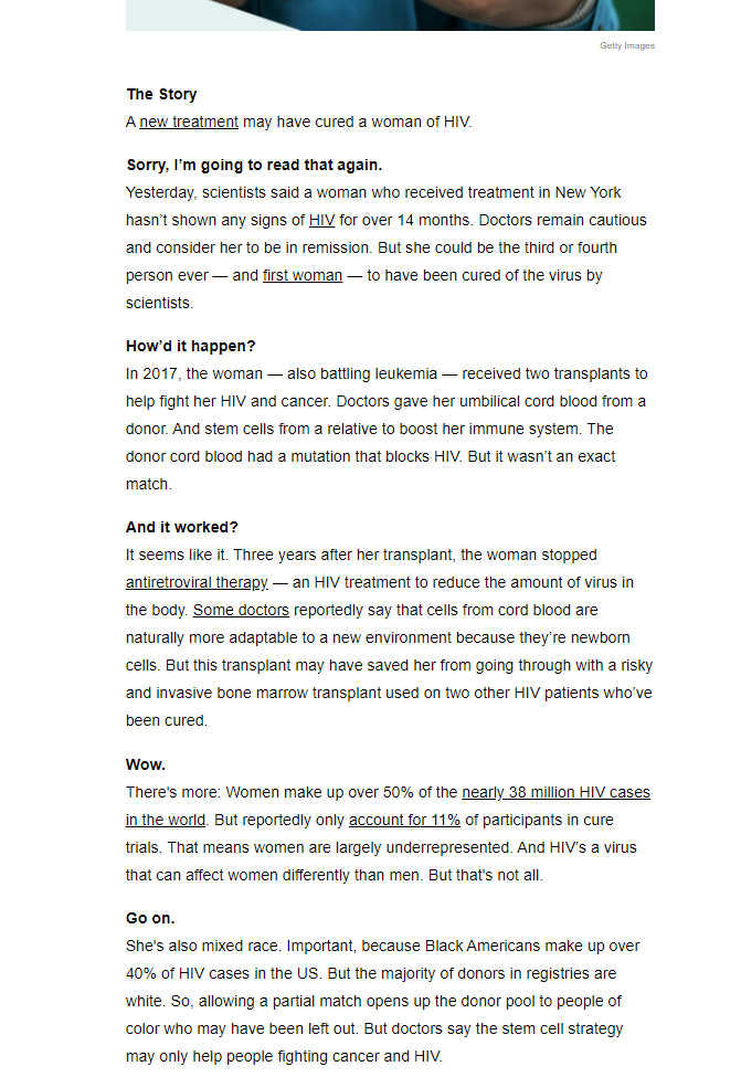
First of all, the top news piece is divided into sections creating a feeling of a conversation with the reader. Just take a look at the example below:
How does it help the reader?
It increases their attention span since such an approach creates a natural flow of engaging conversation. Apart from that, the text is written in an easy-to-understand language and does not overwhelm the reader with jargon, which is usually prohibited in newsletters of that kind.
What about the rest of the email?
Other pieces of news are covered more concisely, but the idea remains the same – to provide as much information to the reader as possible within one newsletter. TheSkimm also shares personal news picks and recommendations and even congratulates subscribers on their birthdays. So, if you subscribe, you might see your name there as well.
Use case: Use a personalized approach to deliver industry updates.
7. Science
Both examples we mentioned above do not really rely on images to tell stories and share updates. But what if you decide to do that?
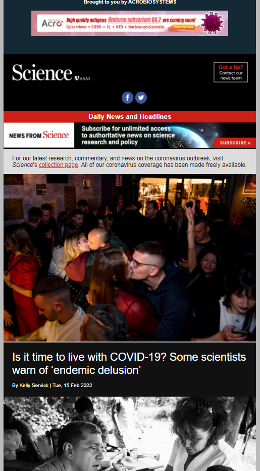
Science already did, and, honestly, it doesn’t look bad at all. Its weekly newsletter uses images and headlines from the website to share the news. All visuals are clickable, and you can select the news piece you’re interested in, press on it, and read the whole story on the website:
How practical is this approach?
If the majority of your subscribers read their newsletters with images on, then you’re good to go. In fact, images can even increase the engagement rates of your newsletter, so you could give it a try.
However, make sure you don’t use heavy visuals. Otherwise, your email won’t open, and you can even end up with a rising bounce rate. So, if you’re just getting started with your newsletter, it’s best to combine this approach with text-only news coverage to see how your subscribers respond.
Use case: Improve email engagement by delivering news in a visual format.
8. Insider Intelligence Daily
If you go back to the previous section, you’ll notice us mentioning that using jargon in a newsletter is not recommended. The reason is simple – it makes your text hard to read and hinders you from reaching out to a wider audience.
Of course, this rule doesn’t come without exception. If most of your readership consists of SaaS business owners and startup entrepreneurs who use professional slang and are familiar with industry-specific terms, you can break the no-jargon requirement when creating content for your newsletter.
Insider Intelligence Daily is a great example of this approach in action. Take a look at the image below:
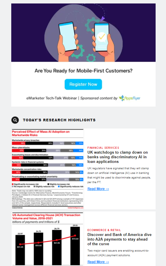
As you can see, the newspaper consists of different reports from a wide variety of industries. Since these reports touch upon very specific topics, it makes sense to use terminology because it will do a better job at explaining the results they show.
So, we have established that you can use jargon in your newsletter but still try to tone it down a bit. There is a golden rule in content marketing – the content should be educational and bring value, but if it’s overcomplicated, you risk losing the reader. So, put effort into making your newsletter readable in the first place.
Use case: Increase engagement by including industry reports in a newsletter (for businesses with niche audiences).
9. Sleeknote
Alright, we’re done with industry news. Now, let’s turn to newsletters that share website resources or recent blog updates that the readers might be interested in.
What are the general recommendations for this kind of newsletter?
- The content picks should be as fresh and up-to-date as possible.
- The selection of articles or resources should ideally be personalized.
- There should be a clear use case for every resource listed in the newsletter.
- The reader should see clear benefits from the selection of resources.
- The resources and articles should address clear pain points.
- Entire content selection should be credible and reliable.
How do you let the reader know that the newsletter contains exactly what they need?
By addressing their needs in the subject line. of course. Take Sleeknote, for instance. The company created a monthly newsletter with website resources providing email, popup, and copywriting examples, and the subject line reflects that:
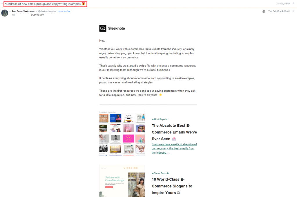
Then comes the introduction specifying why the reader needs these resources and how they will help. The newsletter finishes with the mix of different templates Sleeknote has on its website.
If you take a closer look, you will see the personalization element we talked about when describing the email from Penguin Random House. Sleeknote’s newsletter also addresses its readers from the first person and provides personalized template recommendations from the company’s employee.
Use case: Send a personalized set of offers to increase website visits and boost traffic.
10. HubSpot
If you have a very active blog and want to increase visits and content visibility there, it makes total sense to create a newsletter out of the latest articles.
The rules are the same here – content picks that your newsletter will contain should be high in value and up-to-date. Ideally, there should also be original research that you can mention in the subject line to improve the performance of certain email marketing metrics, such as open rates and click-through rates.
HubSpot uses this approach all the time. In the email below, for instance, it presents a recent report on the 2022 Super Bowl ads and what marketers can learn from them:
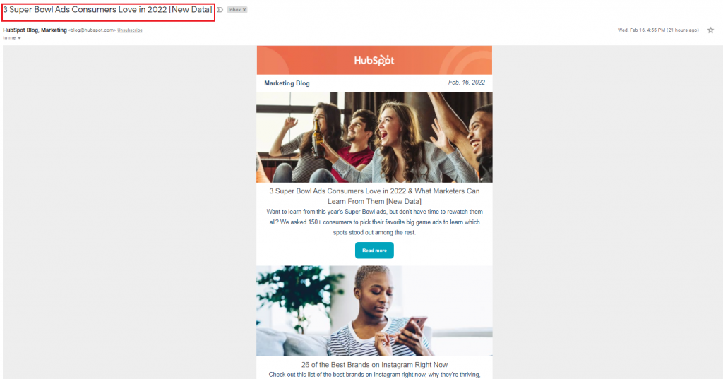
The report is followed by other relevant blog content and promotions of upcoming events. Each has a relevant CTA that sends the reader to the corresponding blog page, where they can read the article in full.
Note: if you’re going to mention a resource from your newsletter in the subject line to attract the reader’s attention, make sure it comes before all others in the body of the email.
Use case: Get more blog visits by featuring the latest articles and research in your newsletter.
11. Moosend
Apart from website resources and blog pieces, you can also send newsletters sharing other helpful content updates with your subscribers. This can be especially handy if you’re using several channels to distribute marketing content.
For example, Moosend uses newsletters to promote their podcast, where they partner with other brands and influencers on creating episodes for specific audience segments:
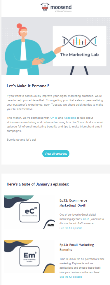
The newsletter above gives an overview of all the podcast episodes Moosend released in January. Each episode has a brief description letting the reader know what they will learn from it.
But what we really want you to pay attention to here is the way Moosend formulated its message to the subscribers. Before the list of episodes comes a short introduction explaining what value they carry and why it is important for newsletter recipients to pay attention to them.
Use case: Grow the number of podcast subscribers by including the latest episodes in the newsletter.
12. VistaCreate
Now, let’s look at a couple of examples of newsletters with product updates. This email type only appears occasionally in the email marketing campaigns involving newsletters, but it is still important for customer experience.
When you’re giving product news, the email newsletter design plays a crucial role. After all, you want the reader to check out all the updates, so breaking them down into sections is vital.
Take a look at the newsletter format below from VistaCreate. Each product update comes in a separate paragraph with a short description of what’s in store for the subscribers:
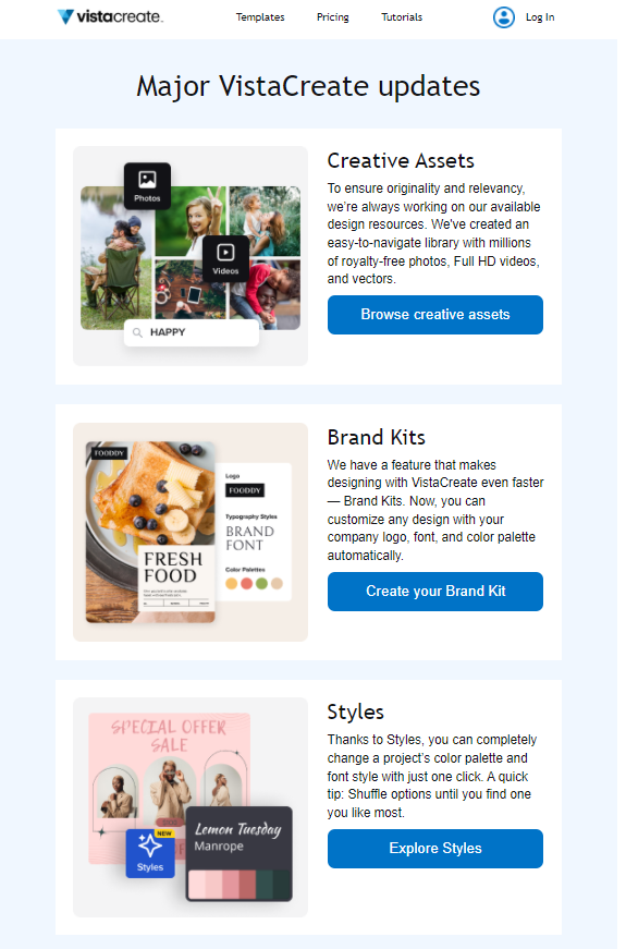
Also, pay attention to the CTA buttons – each one reflects the information provided in the product update it’s assigned to. So, if Vista adds new creative assets to its solution, the CTA invites the reader to check them out. This is the rule of the perfect call to action that we’ve been talking about earlier – it should fit in the context.
Use case: Get more subscribers to convert by boosting their interest in the upcoming product features.
13. DoorDash
Surely, adding a separate CTA to product updates makes your email more structured, but it only works if you have individual landing pages for each of the updates. However, it is not a must-do rule to follow.
What you do need to keep in mind is the design elements of your newsletter. If you’re not going to break the body of the email into separate sections, it’s essential to utilize enough white space to make each product update stand out.
Here’s a good example from DoorDash:
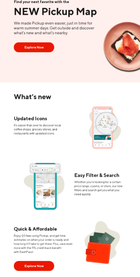
As you can see, white space creates separation between blocks and makes them more eye-catching. Besides, this email serves as a great example for those who have only one landing page for the product updates.
One note here – notice how DoorDash showcases every change to its Pickup map. This approach creates the context for the reader to learn more about the new additions to the product without redirecting them to a different page to learn more. You can use this tactic if you’re planning to add only one CTA to your newsletter.
Use case: Increase sales by promoting new product features.
14. Minor Figures
Similar to product updates, you might also feel the need to use a newsletter as a space to share corporate news and changes related to your brand. This way, you strengthen the connection with subscribers and get an opportunity to showcase the rapid growth of your business.
Minor Figures, for example, created a newsletter to notify its subscribers that it had gone carbon-neutral:
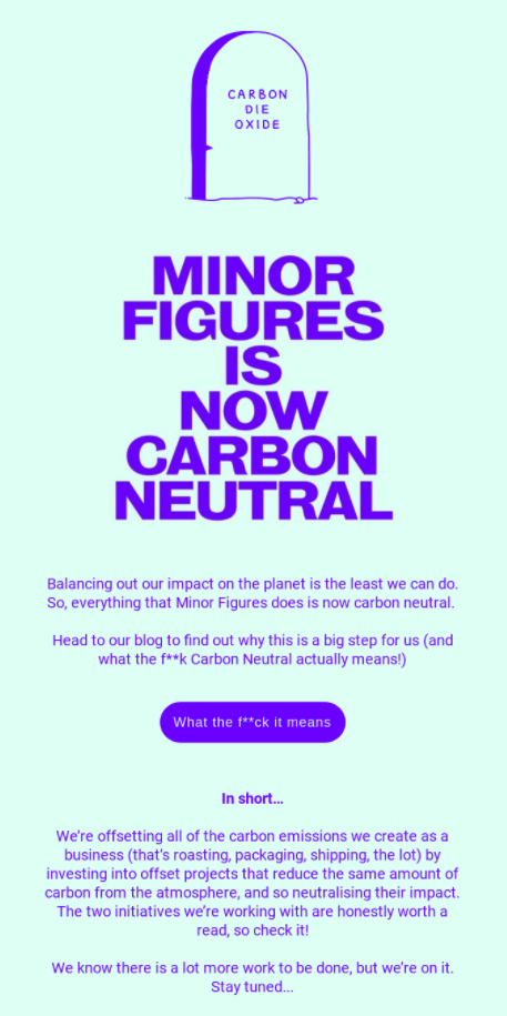
The company sells coffee and oat milk, so there’s a lot of packaging and shipping involved, which are notorious for being carbon-emitting activities (considering the waste they produce). So, with regard to the global efforts to reduce carbon emissions, Minor Figures decided to keep up. And the brand’s audience is most likely in full support of this effort, considering that two-thirds of Americans think more should be done for the climate.
Along with this company change, Minor Figures also notifies its subscribers that it has signed up for climate change initiatives to neutralize the carbon’s impact on the atmosphere. Such an approach can definitely work well to boost customers’ appreciation of the company’s values.
Use case: Keep subscribers engaged by sharing company news.
15. Foundation
If you have recently launched a campaign, you can also use your newsletter to update the subscribers on its results. This is an excellent approach for both B2B and B2C businesses who want to turn more attention to the ongoing campaigns, increase conversions, and boost sales.
For example Foundation, a small business with an app for artists, updates the subscribers on the results of its campaign promoting the works of different creators who’re using this platform:
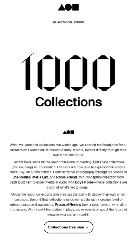
The company boasts the launch of 1,000 artist collections within just two weeks, showing that the campaign has definitely been fruitful. The email also features the names of the creators featured in the campaign so far.
By showing the recipients how well their efforts have paid off, Foundation also inspires them to contribute their works to the collection and monetize them. So, while the newsletter simply informs the subscribers about the results, it also has a hidden agenda of increasing the campaign’s performance and boosting conversions.
Use case: Encourage more subscribers to convert by showcasing successful campaign results.
16. RedBubble
Sometimes brands use newsletters to commemorate an event or support a nonprofit or a cause that means a lot to them. Moreover, it’s important for their readers that they take a stand on public issues – 70% of consumers say so.
However, it’s essential for a company to not just use a public issue for marketing efforts and publicity but organically incorporate a cause into their activities. For instance, take a look at RedBubble – being the platform for artists to sell their products, it honored Black History Month by promoting the works of black artists and telling their stories to the wider public:
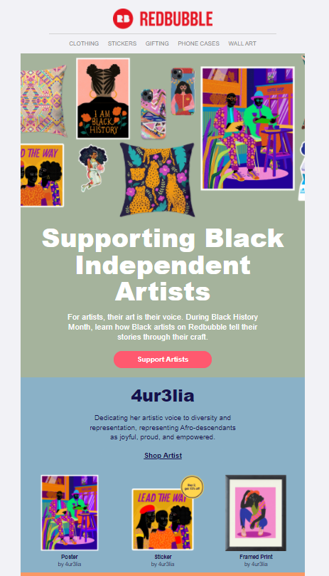
Such newsletters can be occasional, but you still need to maintain a certain level of consistency if you decide to make more email marketing efforts to support an important cause. Otherwise, your subscribers will be quick to call you out for using public issues for PR.
Use case: Strengthen connection with subscribers by promoting an important cause.
17. Think with Google
You can also have content supporting public issues appear in your newsletters regularly, especially if your brand actively supports many of them on a regular basis and has created initiatives for the public to participate in.
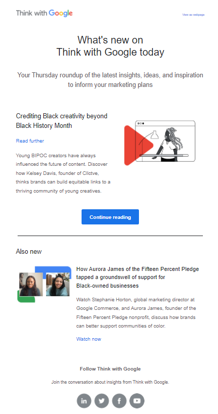
Google, for example, constantly features different causes in its emails. In the one below, you can see it supporting Black History Month and sharing what the brand does for the black community in America:
Here’s one more newsletter example where Google talks about sustainable living:
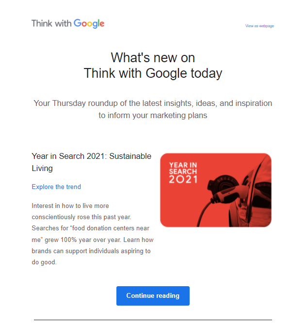
With these emails, Google, as a global thought leader, encourages more of its users to participate in important causes and voice their support to vulnerable communities.
Use case: Improve branding strategy by taking a stand on social causes.
18. Moment
Oftentimes, you’ll see brands send you a thank you message for subscribing, ordering a product, or sharing your feedback. Such messages, much like welcome emails that greet new subscribers, are usually automated and sent as follow-ups.
However, you can also use thank you emails in your newsletter campaigns to praise your subscribers for their contribution. Reasons for such messages can be different, but you should pick something related to your target audience.
For example, this email from Moment is thanking all the subscribers for supporting its product called Grain:
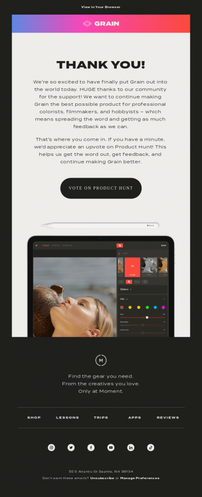
The email asks the recipients to give a shout-out to the platform on Product Hunt to improve its visibility even more. This way, Moment acknowledges the great contribution its audience makes to the brand’s growth. You can also see social media handles encouraging the subscribers to share this message with more people.
Use case: Strengthen connection with subscribers by acknowledging their contribution to business growth.
19. Airbnb
One more great thank you email example on our list of newsletter ideas comes from Airbnb. The company has a tradition of showing appreciation to its users for helping it achieve important milestones.
For instance, in the message below, Airbnb celebrates the growing number of hosts worldwide:
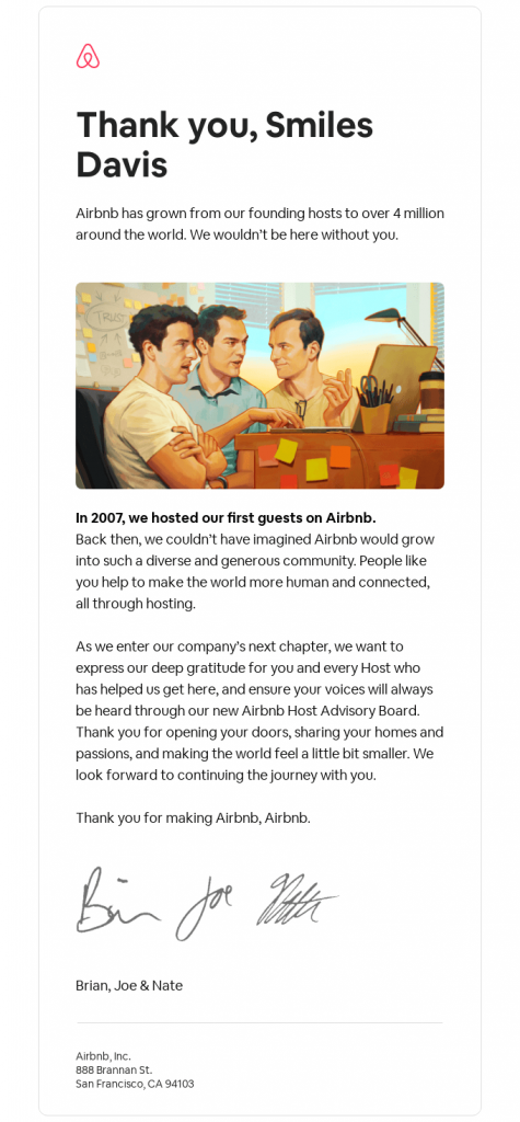
The company reminisces on the first years of business, sharing how big of a contribution each host made to Airbnb’s rapid growth.
You might be asking yourself – do such emails really work in terms of engagement and deliverability?
Back in 2012, HubSpot wrote an excellent report confirming the hidden power of thank you emails. And, if you’re all about the numbers, the report confirmed that such messages generate twice as much engagement as other emails. The ones the resource investigated brought a 42% open rate and a 14% click-through rate. That’s quite impressive!
Use case: Drive subscriber engagement with thank you letters.
Now Over to You
We’ve discussed many great email newsletter examples today, but all of them follow the same rules. Let’s quickly go through them one more time:
- Create a strong message – it should address your audience’s pain points and be relatable to them.
- Include engaging visuals – they complement the message and make the text in your newsletter easier to perceive.
- Optimize emails for mobile – pick newsletter templates that make your email more accessible.
- Work on your call-to-actions – they should tell the reader exactly what you want them to do to convert.
- Personalize your newsletter – win over your readers with personalized offers that match their needs.
Also, don’t forget to give an opt-out option for the recipients to unsubscribe from your newsletter.
Of course, these recommendations look easy on paper, and, in reality, they demand a lot of work. But, hopefully, with our tips and examples, you won’t have a hard time developing newsletter content for your next campaign.
And, if you want to learn more about email marketing, we encourage you to visit our blog!
Frequently Asked Questions (FAQs)
Here are a few points we didn’t mention in our article.
Q1. What exactly is a newsletter?
A newsletter is a marketing tool for businesses and organizations to share important information such as news and industry updates with their network of subscribers.
Q2. What’s the purpose of a newsletter?
Your main goal when creating this email type is to keep your customers and subscribers in the know about the latest news involving your company, product, and the industry your brand belongs to.
Q3. What are some tips for making a newsletter?
There are five elements important for making a great newsletter:
- A strong message
- Engaging visuals
- Optimization for mobile
- Inviting call-to-actions
- Personalization
Q4. What are some good newsletter topics?
You can consider the following ideas for your newsletter:
- Referral programs
- Product announcements
- Coupons and promotions
- Research, case studies, testimonials
- Gift cards
- User-generated content
- Blog updates

Mariia is a content strategist and editor at Digital Marketer’s World. She is passionate about educating others on all things marketing and believes in the power of the written word.
