What is an Infographic? [Examples, Tips, Uses & More]
Infographics are all over the place. You have probably encountered one when researching them and before arriving at our guide.
As a means of representing information in the form of visuals and graphics, infographics have become a useful tool for digital marketers, helping them reach their goals in acquisition, brand awareness, and more.
If you are interested in adding infographics to your digital marketing toolset, then this guide is the right place for you to start.
What is an Infographic?
An infographic (a.k.a. an information graphic) is a piece of visual content that aims to communicate information to its readers by using various types of graphics and copy. The Oxford Dictionary of Media and Communication defines infographics as “Graphical representations of concepts or of patterns in data or information.”
To better understand what this content entails, let us look at an infographic made by Semrush.
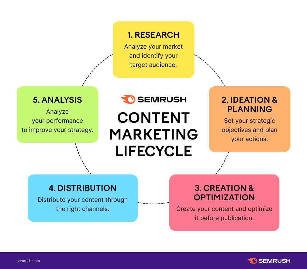
This process infographic is about the content marketing lifecycle that presents its five steps in the form of a loop. It uses a combination of copy (to detail each step) and visuals (the circle that conveys that these steps are in a loop) to illustrate the lifecycle and explain the concept behind it.
With the definition of the term clear, let us continue with the benefits you can get by using infographics.
6 Reasons Why to Use Infographics
Infographics have become a popular tool in the hands of digital marketers, as 74% of them have used infographics in their content.
One of the great sides of this type of content is its flexibility, as you can cover many digital marketing use cases with them.
Among the many instances where you can take advantage of infographics to reach your marketing goals, here are six that are the most popular:
- Raising awareness. Infographics are a great fit for brand awareness campaigns, thanks to their visual component. When you integrate your brand’s colors and logo into infographics that people and other websites share, your brand will get significant exposure.
- Social media marketing. The SMM industry loves visual content as it performs vastly better (213% more retweets from a study on Twitter) than posting only text. Thus, it is natural for social media teams to prefer presenting information in an infographic instead of ordinary text posts.
- Link building campaigns, There is a common link building tactic to do original research with valuable findings and publish it on your site in the form of infographics. With this content, the chances are high that other websites will use your findings and infographics on their pages and reference you with a backlink.
- Simplifying concepts. Another great side of using visuals is that you can explain relatively complex information and processes with simple and interactive graphs. The content marketing lifecycle infographic is a great example of this.
- Present research findings. We touched upon this topic in the link building point. Other than facilitating link building, you can also use infographics with original research for many other purposes, including increasing the trust and authority of your website in the eyes of your visitors.
- Compare different things. Infographics also work quite well for making comparisons, as you can visually organize the information about the two (or more) items and highlight their similarities and differences in an easy-to-understand way. Side-by-side comparisons are probably the most common way of making such infographics.
To sum up, infographics are a highly flexible medium for conveying information to your audience. But what kind of information can you place in an infographic? We have the answer to this question coming up next.
5 Key Types of Infographics
There are no strict rules on how to create an infographic or what kind of information to place in it. The sky is your limit, and you have infinite creative freedom for deciding both on the visuals and the copy of your infographics.
However, the digital marketing industry, going through too many trials and errors, has come up with several types of infographics that perform well. Here are five of them that you can consider using.
Type #1: Statistical or data visualization infographic
Numbers are boring and statistical numbers are just straight tedious.
But if you place these numbers on a canvas and add compelling visuals, they suddenly become fun and digestible.
There are two characteristics describing data visualization infographics the best:
- Use font size, color scheme, and placement to create a visual hierarchy of the numbers by emphasizing certain statistics or data points and placing others in secondary positions.
- Present data with images or illustrations relevant to the topic covered by the infographic (e.g., pie charts, bar charts, flowcharts, animations, etc.).
Here is an excellent example of a statistical infographic from the 2018 INRIX Global Traffic Scorecard.
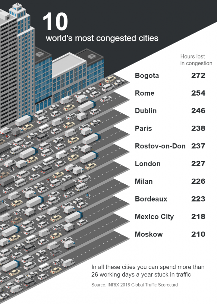
In the image above, we can see the list of 10 cities with the worst traffic jams in the world. The authors of this infographic have used illustrations of congested roads to add more essence to the data. They have also used visual hierarchy to attract the attention of their viewers to the title first, then the list of the cities, and finally to the data source.
Type #2: Comparison infographic
Making comparisons is difficult if you are limited only to using text.
Your comparison might be about items with tens or more characteristics that you need to touch upon (e.g., for smartphones, you might have to compare 50+ different specs), and you can end up with a long piece of text that is hard to read and understand.
Infographics, on the other hand, make comparisons much more readable thanks to their ability to “put things side-by-side” for your readers’ eyes to quickly scan and focus on the characteristics they are interested in.
Here is what a typical comparison infographic looks like.
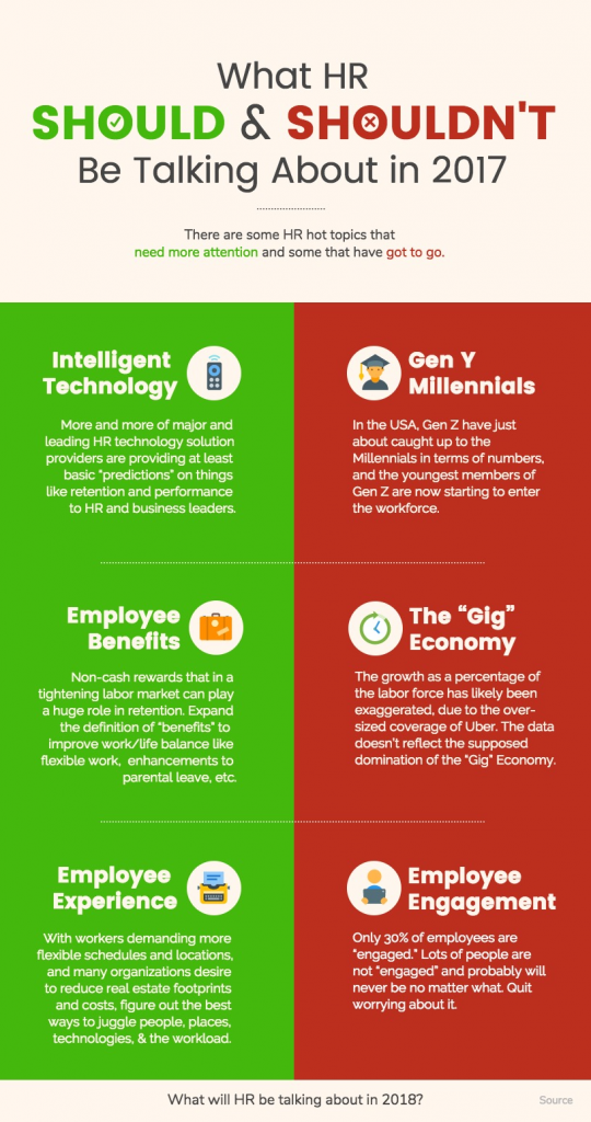
Here we can see a list of DOs and DON’Ts for human resource specialists. These are the topics that they should pay attention to as well as the ones they should ignore.
Type #3: Informational infographic
Sometimes there are no statistical numbers you want to show, nor do you need to compare anything; you simply want to present information.
Infographic design is a valuable tool in this case too. As a visual representation of data, infographics are an engaging way of conveying your information. By adding visual elements to your infographic and placing whitespace between the paragraphs with information, you can make large pieces of complex text more digestible and visually appealing.
Informational infographics are probably the most flexible type on our list as they can contain anything, from an explanation of a given concept to tips for cooking and more.
The example below is an informational infographic made by Adobe that contains tips.

This infographic gives five pieces of advice for increasing your productivity. Each tip here has a relevant graphical element placed next to it that gives readers a hint on what the tip is about, thus, increasing the readability of this infographic.
Type #4: Timeline infographic
Another strong side of infographics is that they are a great fit for any content that is narrative in nature.
Although using plain text for narratives has always been more common, they are still long and tiring. Considering the exceptionally short attention span (8 seconds according to a Microsoft study) of readers on the internet, you might risk losing readers by using long text.
This is where infographics come to save the day. For instance, if you want to do storytelling involving a timeline of events, you can make a compelling infographic that will draw a path and pinpoint events in it.
By keeping your content visual, you will significantly decrease the time it takes for people to consume it, as humans process visual content 60.000 times faster than text.
Timelines look great on infographics, and here is an example to prove it.
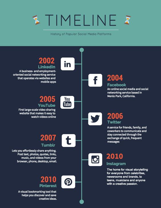
Here we see the path for the development of social media in the form of a timeline where each point is the creation date of a popular social media platform.
Type #5: Step-by-step or listicle infographic
The final type of infographics that we want to mention is listicles (a term that has combined “lists” with “articles”).
Unlike narrative content, lists are relatively easy to read thanks to using bullet points or headings. However, you can take that readability up a notch by moving your list into an infographic and replacing the bullet points with relevant icons or illustrations.
A list infographic would typically look similar to this.
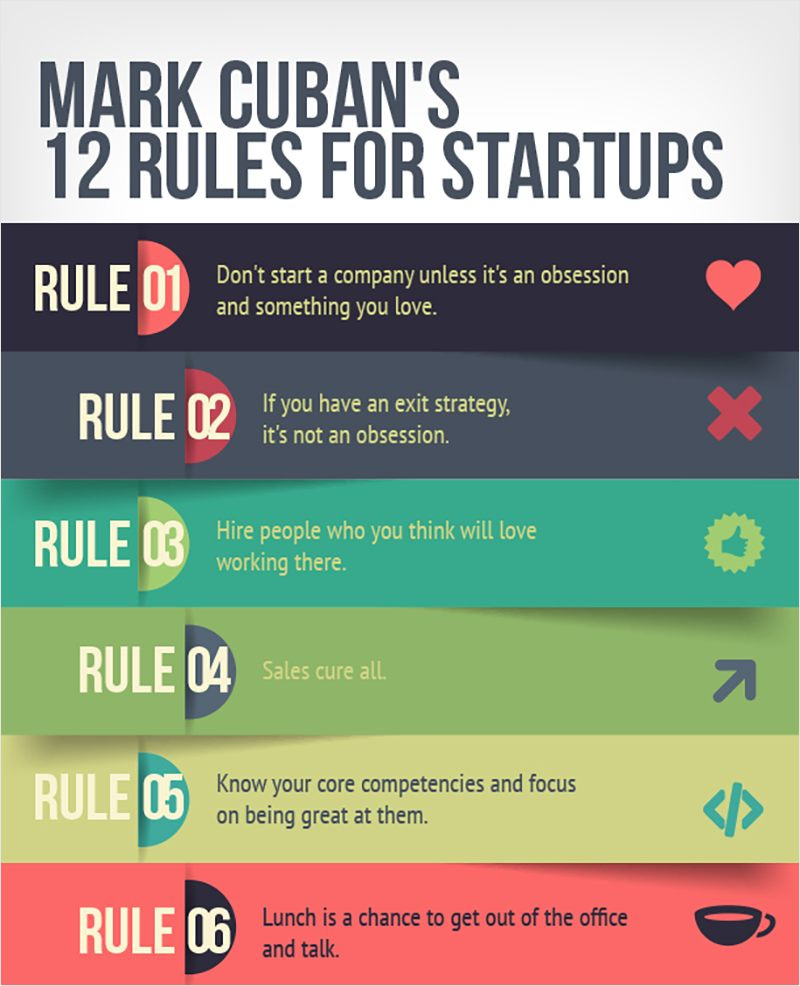
What we see in the example above is a tutorial with rules that a popular entrepreneur and investor Mark Cuban has devised for building a successful startup.
How to Make an Infographic in 4 Simple Steps
That is right, infographics are all about visuals and compelling graphic design. But a great-looking infographic does not necessarily mean a well-performing one, especially from the point of view of digital marketing.
When making infographics, proper planning and content best practices are as important as a good-looking design.
But no worries. Here’s a simple list of four steps that you can take to ensure that you have effective infographics that help you reach your digital marketing objectives.
Step #1: Set your goals
No digital marketing activity is effective or meaningful if it is not contributing to your goals.
Thus, naturally, we start with defining the outcomes you wish to achieve with the help of your infographics.
As a content marketing tool, infographics are quite universal and can contribute to a variety of goals, including:
- Increasing the organic traffic of your blog.
- Adding the number of natural backlinks to your website.
- Increasing your brand awareness and improving your audience’s trust in you.
- Boosting the engagement level of your social media followers and more.
We always start with this step as your choice of goals will directly affect the type of infographic you want to use, its design, content, and other aspects.
For instance, if you want to boost social media engagement, you can have a listicle with tips that your followers will comment on. On the other hand, you can attract backlinks with original research and a statistical infographic that other websites will start borrowing.
Step #2: Define your target audience
With the desired end results in mind, you will need to understand who the people you want to target to reach your goals are.
The best course of action for getting your audience right is to:
- Check who your competitors are targeting.
- Use publicly-available quantitative data sets (e.g., reports available on Data.gov or Statista) to find out the demographics, locations, and other characteristics of the people you want to target.
- Interview several of your potential users to understand their problems, needs, goals, and motivations.
When you have all this data on your hands, you can go ahead and consolidate it into your persona, which is a document listing all the characteristics of your typical users.
Personas serve as your guiding stars when creating infographic content or marketing campaigns, as whatever you do needs to be aligned with the needs and the reality of your personas.
Step #3: Choose an infographic type
Different types of infographics serve different cases, and your choice of them will directly depend on your goals and personas.
To better illustrate our point, let us look at two examples with different audiences and desired results.
Example 1. You are doing the digital marketing of a B2B SaaS product, your goal is to increase revenue, your strategy is targeting the users of competitors, and your persona is a company executive that will change a tool their company uses only after a thorough pros/cons research.
To fulfill your goals and match your persona’s needs, you can choose the comparison infographic and put your product side-by-side with one of your competitors and show all of your pros along with their cons.
Example 2. You are managing an eCommerce store selling culinary equipment for cooking at home. Your aim is to attract relevant traffic to your website, and by relevant, we mean millennials who are health-conscious and want to cook at home instead of ordering food.
In this case, you can use the step-by-step guide format of infographics and show how to use a chef’s knife like a pro.
Step #4: Gather your information and organize your data
Finally, it is time to start gathering the necessary data and content to use in your infographics.
Depending on the type of infographic and the topic you want to cover, this step can range from minutes to weeks or even months.
If you want to speak about the steps of cooking pasta, then the information you want might be a single Google search away. On the other hand, if you want to publish original research on the correlation between the number and authority of backlinks and your website’s rankings in search results, then your team might have to analyze a massive amount of data and extract findings out of it.
That was it. These four steps do not seem too complex, right? The good news is that you are likely to have done the first two steps already for your other campaigns, making this list even shorter for you.
In any case, by following these steps, you can transform your infographics from mere pieces of visual content into high-performing marketing tools.
With the goals and content covered, let us move on to designing infographics.
3 Cool Infographic Makers to Try
If somebody tasked you with infographic creation, you would probably start looking for a designer to delegate that task to. Although hiring designers to make your visual content is a popular and viable idea, you can do it yourself too.
There are plenty of easy-to-use design tools with drag-and-drop interfaces that you can use to make your own infographics.
Some of the most popular are:
All three tools mentioned here also come with a library of pre-made designs and infographic templates (including all types of infographics we have listed previously) that you can use instead of designing from scratch.
As we have the design aspect clear, too, it is time to share several tips and best practices to help you reach better results.
5 Infographic Best Practices
Infographics are a well-tried type of content, and digital marketers who have mastered them have amassed a number of best practices that help them get the most out of the infographics they make.
Here are five of these best practices for you to consider:
- Keep the focus on the main point. Although you can fit lots of information into an infographic, you need to make sure that you are not doing a deep dive into the topic and overstuffing your infographic, as you will end up losing readability. Instead, try to stay brief and have only one main point in the content.
- Let your visuals tell a story. It is always better to show than tell. By incorporating the right and relevant visual infographic elements, you can substitute entire paragraphs of text with a single illustration.
- Create a flow on the infographic. Placing text and visuals on a canvas in random order will make your infographics confusing and unreadable. Thus, you need to make sure that your elements are placed in an order your readers can follow from one element to another naturally.
- Pay attention to the font. Generally, you should avoid using any decorative font for body text and reserve it for the headline only. Other than the font type, the size and color matter too. The best practice is to use contrasting sizes and colors to help readers differentiate headlines from subheaders and body text.
- Keep your colors consistent. If you use colors that are too diverse, it will confuse your readers. Designers usually select a couple of infographic colors and stick to them for all the elements on the canvas, including the background, text, and graphics.
Knowing these best practices will definitely help you, but you also need to avoid the common mistakes that digital marketers make with their infographics.
3 Common Infographic Mistakes
If you are new to the craft of infographics, it is easy to make common mistakes. But don’t worry, here are the main three that you can easily avoid:
- Using too much text. The beauty of infographics is in the visual elements. By making it text-heavy, you are hurting its readability.
- Using too many design elements. Simplicity and minimalism are the key components in easy-to-digest infographics. Make sure that you are not flooding it with too many items.
- Using clashing colors. Too many colors and colors that clash both complicate visual representation and decrease readability.
To conclude, by paying attention to these three points, you can significantly increase the quality of your designs.
Now let’s wrap up our guide and take a look at great examples of infographics.
5 Infographic Examples to Inspire You
The internet is full of eye-catching and beautiful infographicsб and we have brought five of them that can serve as sources of inspiration for you.
Example #1: Wordstream’s on-page SEO infographic
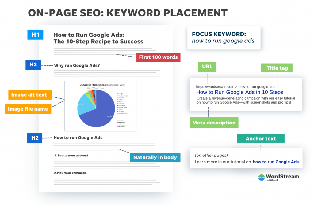
This is an informational infographic made by Wordstream that visually pinpoints the key elements where SEO experts need to place their keywords.
Example #2: Golden Home Fitness’s Mental Health Awareness infographic

Here we have a mixed-style infographic made byGolden Home Fitness. It includes statistical data, steps for staying healthy, as well as an explanation of how everything works.
Example #3: Commissionfactory’s affiliate marketing infographic
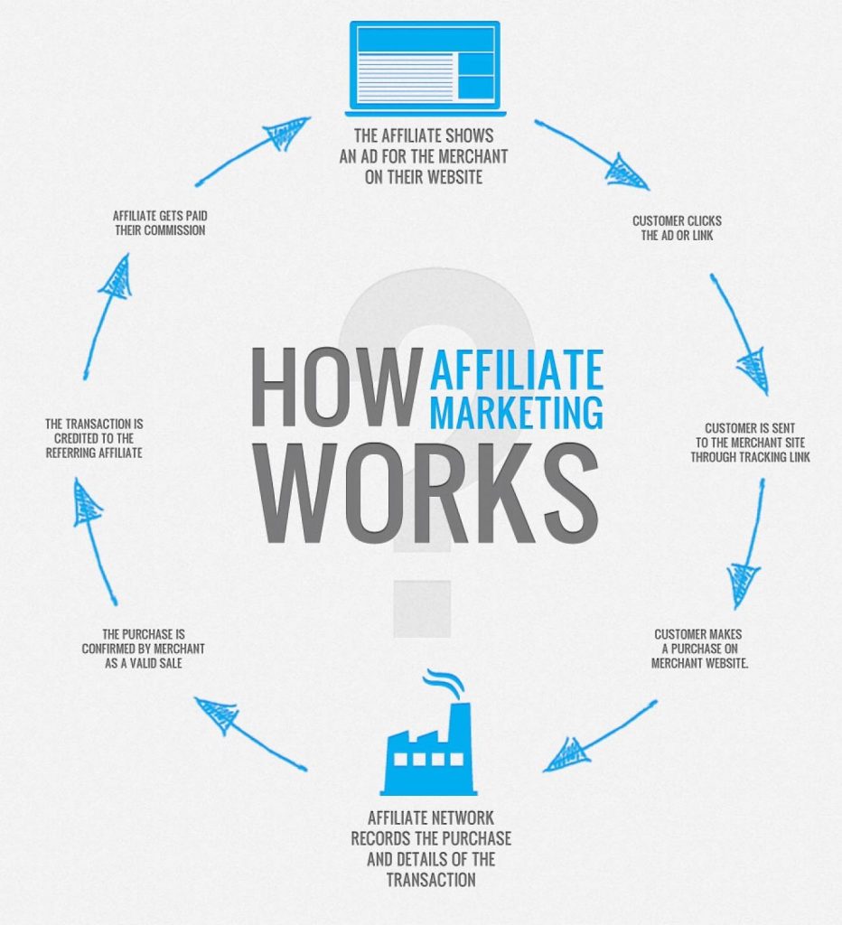
The loop above is a typical example of a step-by-step infographic. In this case, CommissionFactory shows you the steps it takes for affiliates and affiliate networks to interact with each other.
Example #4: EPA’s facts on leaks infographic
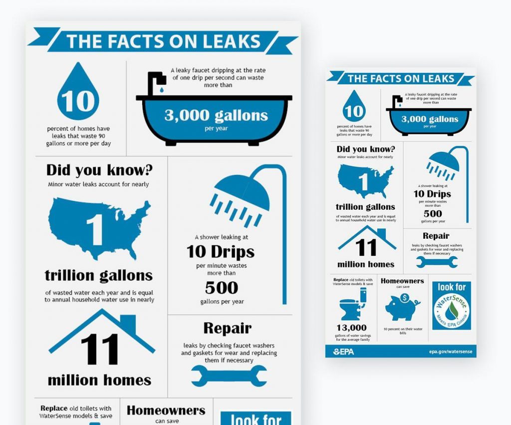
This statistical infographic was made by the Environmental Protection Agency. Here, the nonprofit government agency shares a series of statistics and numbers with us about the leaks in the U.S.
Example #5: Mangools’ white hat vs. black hat SEO comparison infographic
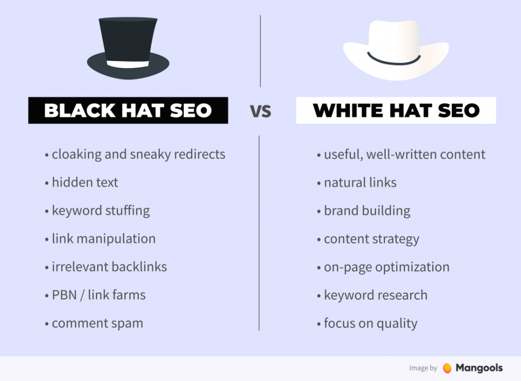
Finally, let’s look at the comparison infographic. This one, created by Mangools, highlights the differences between black hat and white hat SEO.
Bonus: The History of Infographics
Infographics are much older than you think. Technically, infographics are any group of visuals that conveys some sort of useful information. Thus, we can say that the prehistoric paintings in caves are the first prototypes of infographics.
Returning to relatively modern times, the first print infographic belonged to William Playfair, who made a series of charts and histograms about the English economy back in 1786.
Finally, we have the modern age of the internet, where companies compete for the attention of their potential customers, and their great infographics serve as lightweight “carriers” of information that help them catch our attention.
Now Over to You
Infographics are compelling, flexible, and effective visual communication tools in the hands of content marketers. Thanks to their visuals, they are able to convey a large amount of information without boring the reader.
You can use infographics in your digital marketing strategy too. Just follow our guide, and you are good to go.
This was one of the many guides we have published about digital marketing. If you want to read more, make sure to check out our blog.

Sona Kalantaryan is a senior digital marketer with a creative past. Big fan of high cinema and well-optimized landing pages. She authors guides by sharing the best practices and does it the right way!
